Amber Tiles had built its reputation around in-person showroom advice, but buying online introduced a different set of problems. Price and availability changed by location, customers approached the catalogue with different levels of intent, and ordering the correct quantity required practical guidance.
As part of the Overdose team, I designed the responsive customer journeys and UI system. My work covered regional store selection, product discovery, material calculations, interactive prototypes, developer handoff and design QA.
The brief
The new experience needed to bring Amber’s showroom knowledge online while working within regional pricing, inventory and fulfilment rules. It also had to support customers who knew exactly what they wanted and those who were still exploring materials, rooms and styles.
The broader Overdose team delivered the Adobe Commerce platform, HarmoniQ ERP integration, analytics, payments and regional storefronts. My work focused on customer journeys, interaction design, the responsive UI system, prototypes and design quality through implementation.
My role and collaboration
Working under the direction of the Chief Experience Officer, I was responsible for UX/UI execution across discovery support, architecture recommendations, responsive Figma design, ProtoPie prototyping and final design QA.
I worked with strategy, technical and delivery specialists throughout the project. This helped connect customer-facing decisions to the regional storefront, inventory and fulfilment logic behind them.
Location dictates the offer: Prices, fulfilment and stock varied by region, requiring early location clarity before browsing.
Buyers arrive with different mental models: Trade professionals searched for specific items, while homeowners and architects explored by room, finish, or aesthetic trend.
Physical purchases need practical guidance: Ordering required accounting for room dimensions, tile cuts, breakages, and future batch repairs.
Inspiration should flow naturally into commerce: Editorial articles and project showcases needed clear paths to evaluation without turning every piece of content into a hard sell.
01
Regional confidence first
Price, stock and fulfilment varied across Amber’s franchise network, so customers needed to establish their location before relying on product information. Automatic location detection alone was not dependable enough.
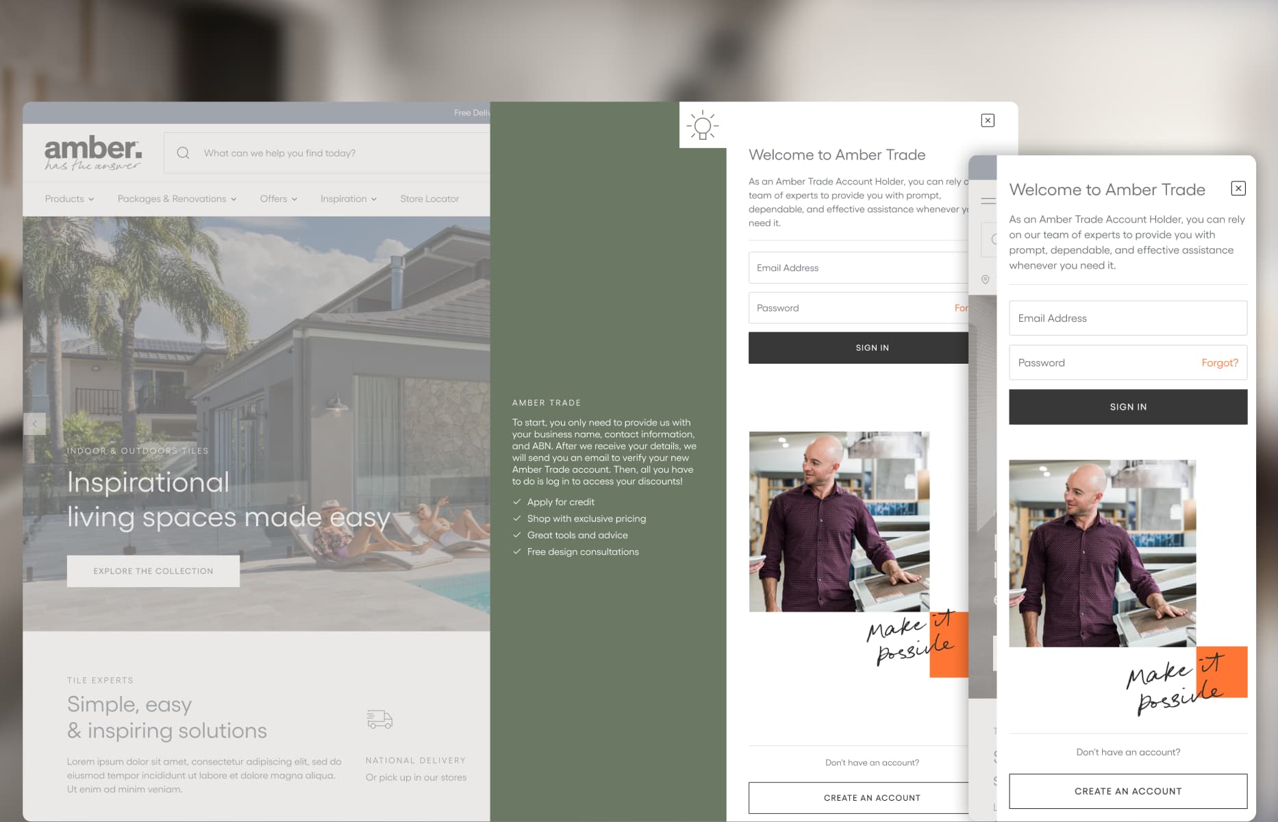
I designed an upfront postcode selector and kept the chosen store visible throughout the journey. Working with the technical team, I translated Adobe Commerce and HarmoniQ ERP rules into clear customer-facing states, including location changes and checkout validation.
02
Supporting inspiration-led discovery
Trade customers often arrived with a product in mind, while homeowners and designers were more likely to explore by room, finish or visual style. A single category tree could not support both behaviours well.
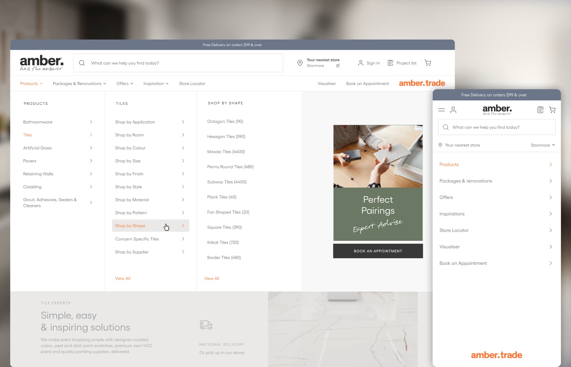
I designed complementary routes into the catalogue: direct product navigation for high-intent customers, room-based pathways for renovators and inspiration organised around finishes and trends.
03
Connecting editorial content to products
Project stories and design advice were useful starting points, but they sat apart from the buying journey.
I introduced reusable product blocks inside editorial content. Customers could understand why a finish was used in a particular space, then move directly to the relevant product without losing the context that made it useful.
04
Practical material calculations
Ordering too little material can interrupt installation, and matching the same batch later may not be possible. This was the kind of practical advice customers would normally receive in a showroom.
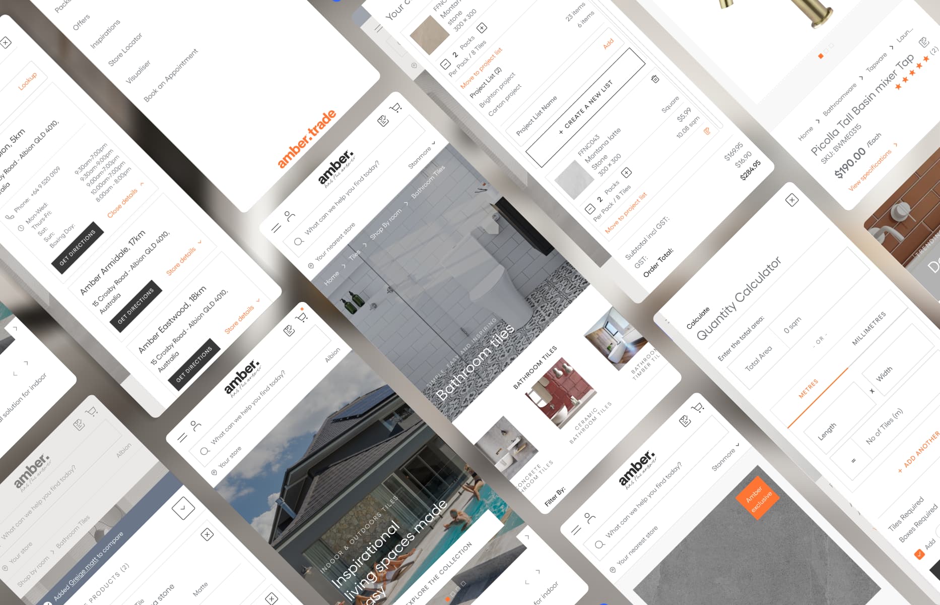
I designed a material calculator that estimated coverage and included an Add 5% contingency option for cuts and breakages. Quantity, pack information and shipping weight stayed visible as the customer adjusted the order.
05
Scannable material hierarchy
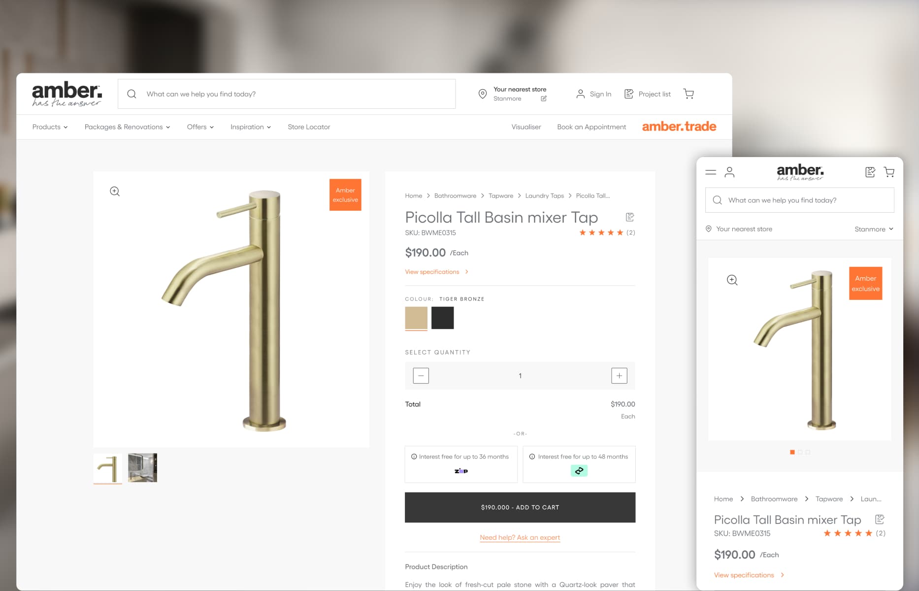
Tile selection is visual, but customers also need dimensions, finish, variation, availability and pack information before they can decide.
I structured product cards and detail pages so imagery remained prominent while technical information stayed easy to scan. Regional stock and labels such as Amber Exclusive were visible without competing with the product itself.
06
Scalable design system adaptation
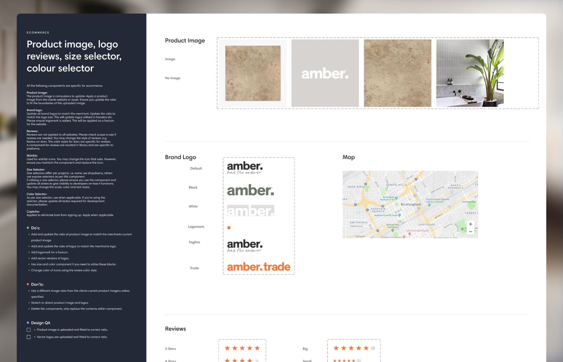
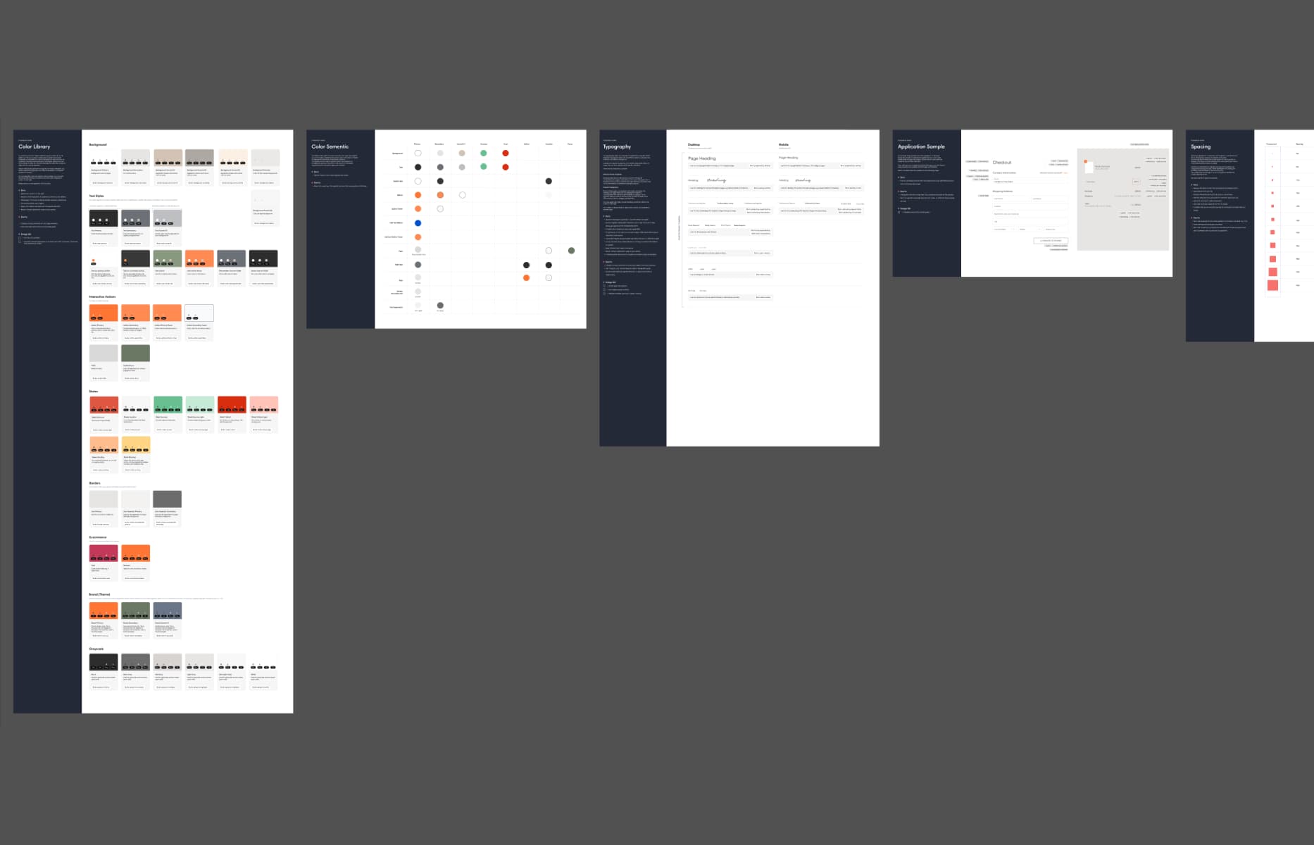
The project used Overdose’s shared ecommerce foundations rather than starting every component from scratch. I adapted those patterns to Amber’s brand and created the variants needed for its catalogue, services and editorial content.
Figma variables and design tokens supported navigation, forms, product pages and CMS blocks. The library gave developers repeatable specifications while leaving Amber’s team room to expand the site after launch.
Prototyping complex behavior
Static screens did not explain behaviours such as location selection, quantity updates and embedded media clearly enough.
I built high-fidelity ProtoPie prototypes so the client and delivery team could review those interactions before development. Amber later asked for the prototypes to be adapted into presentation videos for senior stakeholders.
From design to launch
I prepared annotated Figma specifications, a project style guide and responsive assets for development.
During implementation, I reviewed component states, breakpoints, spacing and typography across desktop and mobile. I documented issues and worked with the delivery team to keep the released interface aligned with the intended design.
What I learned
Amber showed me that complex retail journeys are shaped as much by operational rules as by customer intent. Regional inventory, pricing and physical material requirements could not be hidden; they needed to be explained at the right moment.
Staying involved through prototyping, handoff and QA helped preserve those decisions as the work moved from Figma into production.
Interface in context
UI Gallery
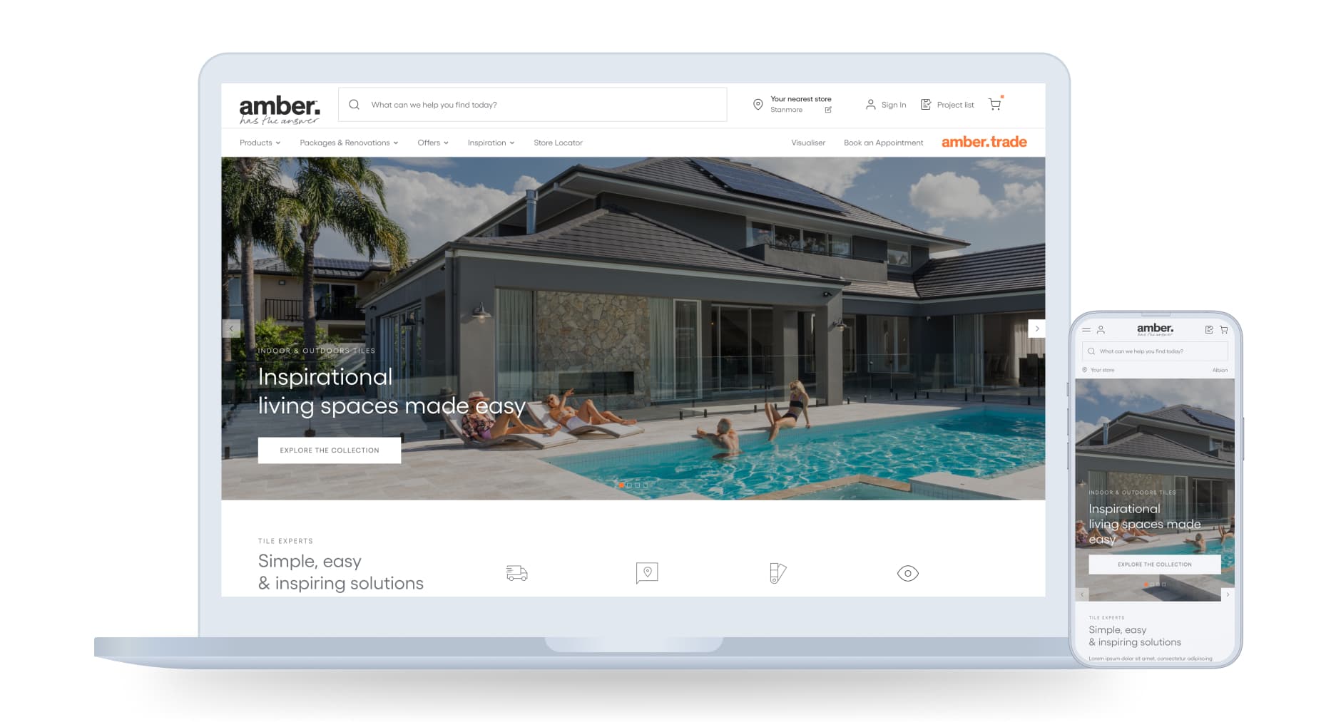
Selected screens showing how the experience translates key decisions into a clear, consistent interface.
Delivered work
What shipped
A location-aware ecommerce experience supported by reusable components, documented responsive behaviour and implementation QA.
01
Clear regional context
Customers selected a local store early and kept the relevant pricing and availability throughout the journey.
02
Flexible product discovery
Customers could begin with products, rooms, finishes or inspiration rather than following one catalogue structure.
03
A maintainable UI system
Reusable components and CMS blocks supported product, service and editorial content after launch.
The result
The Adobe Commerce platform launched as part of Overdose’s broader digital transformation for Amber. It connected regional storefronts, product content and customer journeys in one responsive experience.
Constraints and trade-offs
Challenge → Design response
Each response traces back to a customer, operational, or platform constraint.
01
Challenge
Prices, stock and fulfilment varied across Amber’s decentralised franchise network.
→
Design response
Ask for a postcode early, connect the customer with the appropriate regional storefront, keep the selected store visible and validate the shipping region during checkout.
02
Challenge
Trade customers often arrived with a product and quantity in mind, while homeowners, interior designers and architects explored by room, finish or trend.
→
Design response
Create complementary product-led, room-led, inspiration and trade pathways so each audience could begin with a familiar mental model.
03
Challenge
Customers needed to order enough material for their space while accounting for cuts, breakages and the risk of unavailable stock later.
→
Design response
Design a material calculator that estimated the required quantity and offered an Add 5% contingency option before purchase.
04
Challenge
The experience needed to support varied product and editorial content while remaining practical for Amber’s team and developers to maintain.
→
Design response
Adapt a reusable Figma design system through variables, tokens and client-specific variants, then translate it into documented components and CMS blocks.
From ambiguity to delivery
Design process
The process was not strictly linear. Each stage reduced a different kind of risk and informed the next design decision.
01
Understand the business and customer context, review the available Google Analytics data with the wider team and study comparable ecommerce experiences.
02
Frame the information architecture with the team and prioritise regional pricing, product discovery, material quantities and content-led shopping.
03
Design the responsive journeys in Figma and use ProtoPie prototypes to review complex behaviour with the client before development.
04
Prepare annotated designs, project styles and responsive assets, then support implementation and complete design QA across desktop and mobile.
1 / 1
DIGITAL PRODUCT DESIGNER
I’m Luis Saavedra.
My background in industrial design still shapes how I work: I think of digital products as practical tools that need to be clear, useful and well made. I bring that approach to complex workflows, clean UI and design systems that hold up in production.
.jpg?g-8201f4f4)
.jpg?g-8201f4f4)
.jpg?g-8201f4f4)
.jpg?g-8201f4f4)
.jpg?g-8201f4f4)
.jpg?g-8201f4f4)
.jpg?g-8201f4f4)
.jpg?g-8201f4f4)
.jpg?g-8201f4f4)
.jpg?g-8201f4f4)
.jpg?g-8201f4f4)