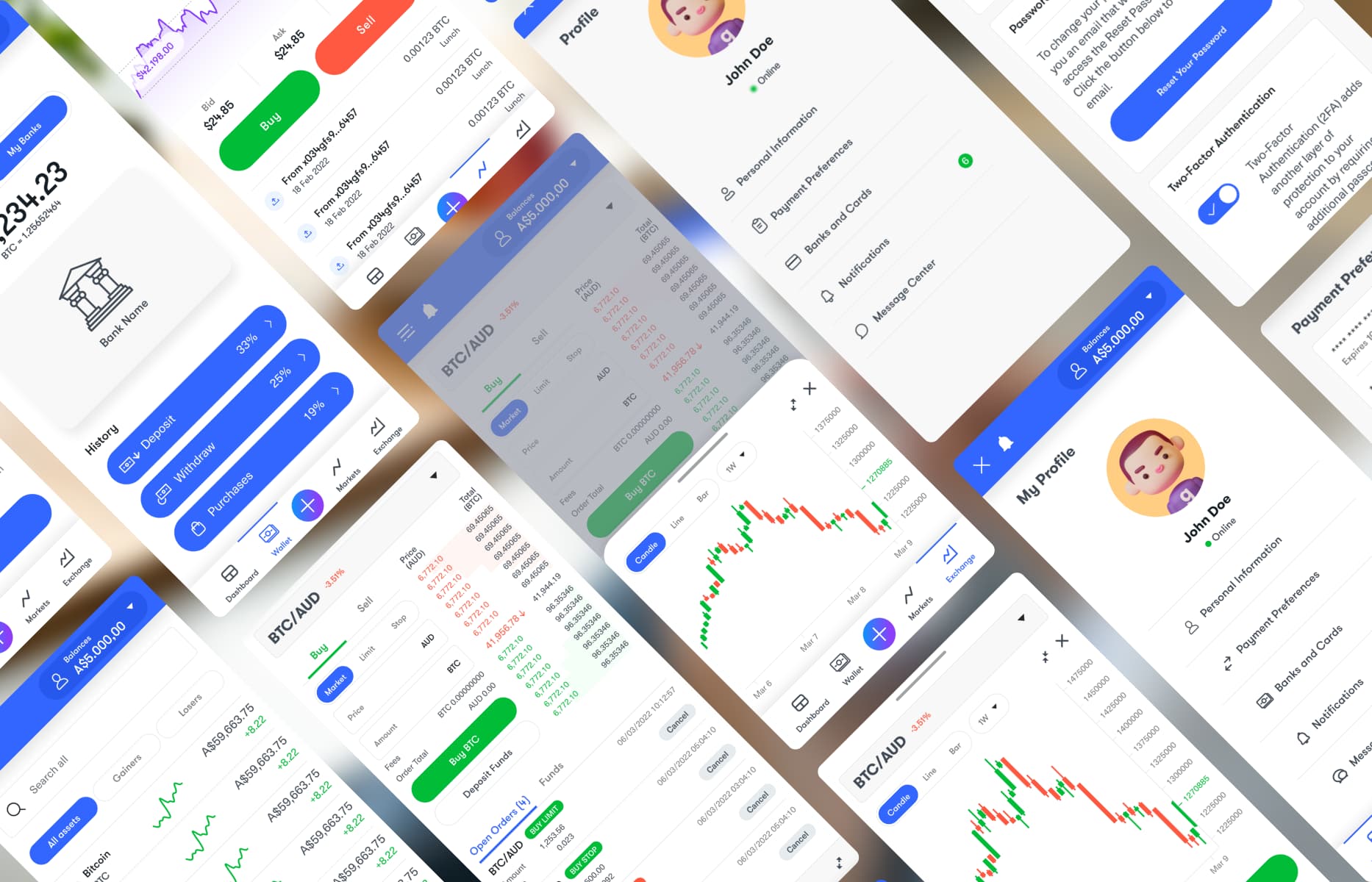
Fintech dashboard and mobile product case study

Making crypto trading clearer across web and mobile

BTC.com Australia was redesigning its trading platform for customers with very different levels of experience. New customers needed more guidance through onboarding and identity verification, while active traders needed quick access to market data, balances and account actions.

I worked with the Chief Design Officer across the responsive dashboard, mobile experience and supporting UI system. The work later extended to the public website and implementation QA.

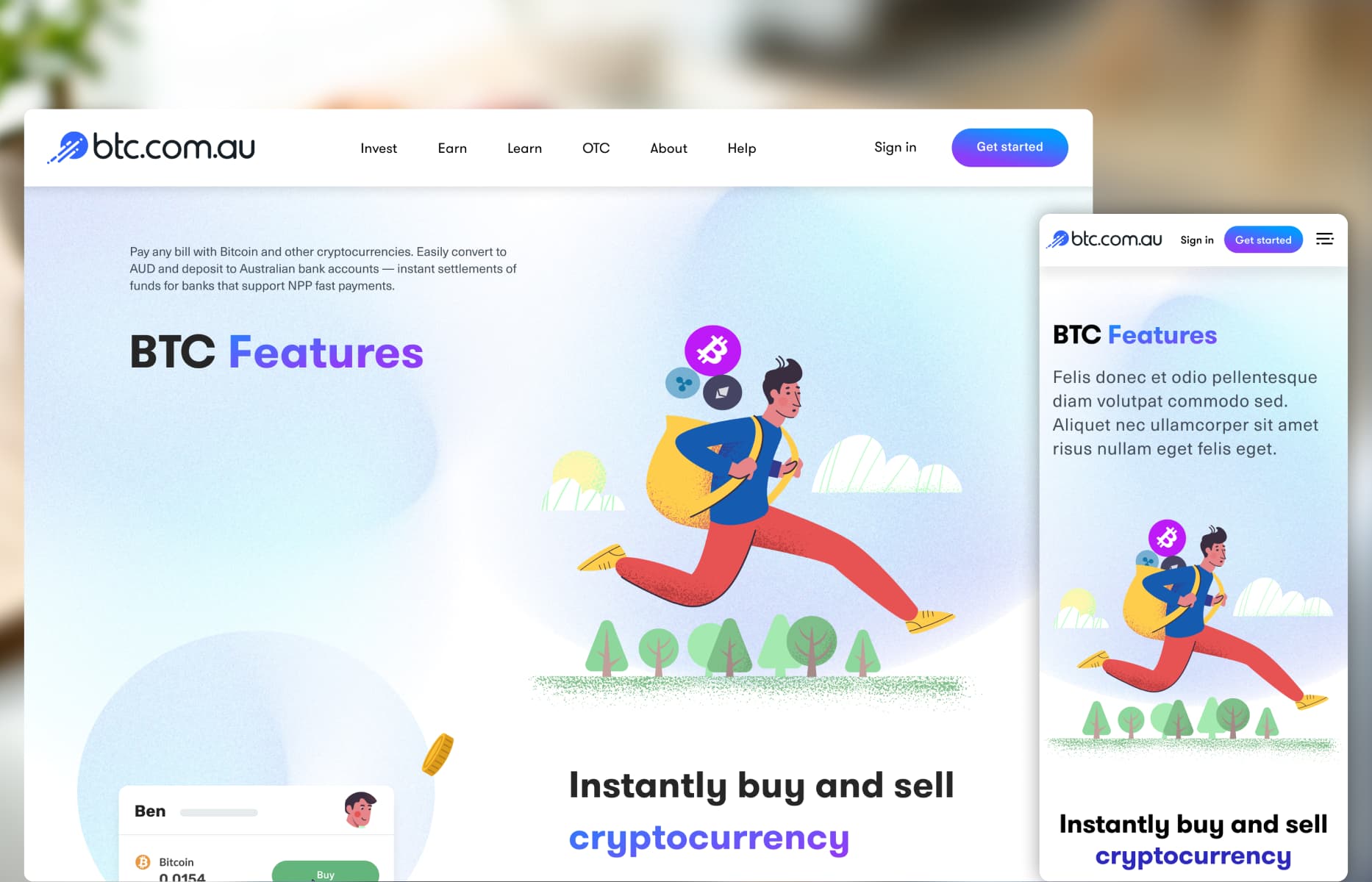
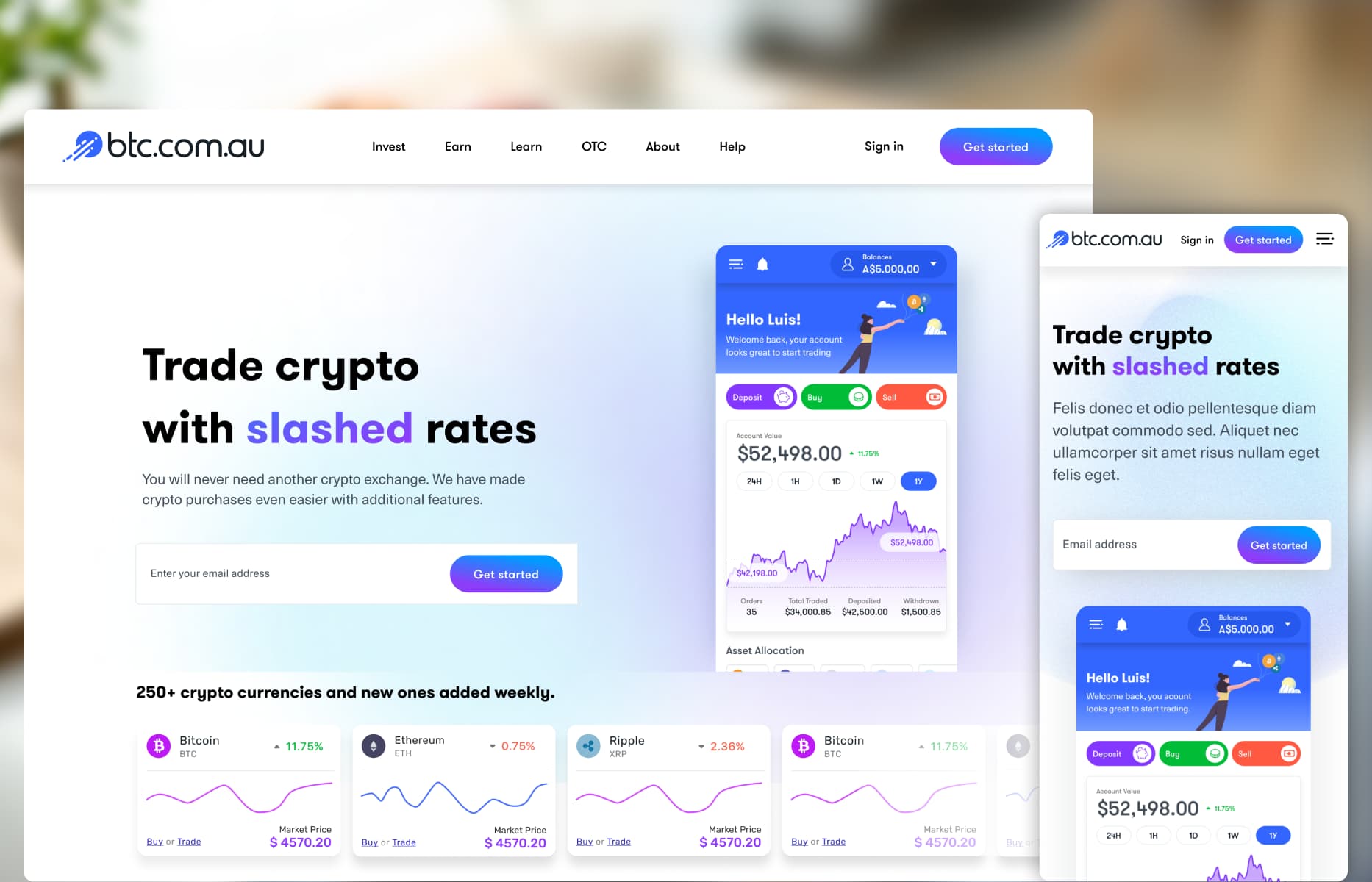
BTC.com Australia homepage

The brief

The existing product brought market information, portfolio data and account tools together without a clear hierarchy. This made the dashboard difficult to scan and created additional friction during identity verification.

The redesign needed to organise that information more clearly while keeping the product useful for experienced customers. It also needed to work across desktop and mobile without forcing the same layout onto both.

My role and collaboration

As Lead UX/UI Designer, I was responsible for the dashboard structure, responsive UI, mobile layouts, identity-verification flow and product components in Figma.

I worked with the Chief Design Officer on the overall direction and with BTC.com Australia’s internal team during handoff. Their engineers managed the application build, backend infrastructure and compliance logic. I also completed design QA for the implemented web application and public website.

  • Dashboard and information hierarchy: Organising market trends, portfolio summaries and account actions around customer priorities.

  • Responsive product UI: Designing web and mobile interfaces with different navigation, density and content order.

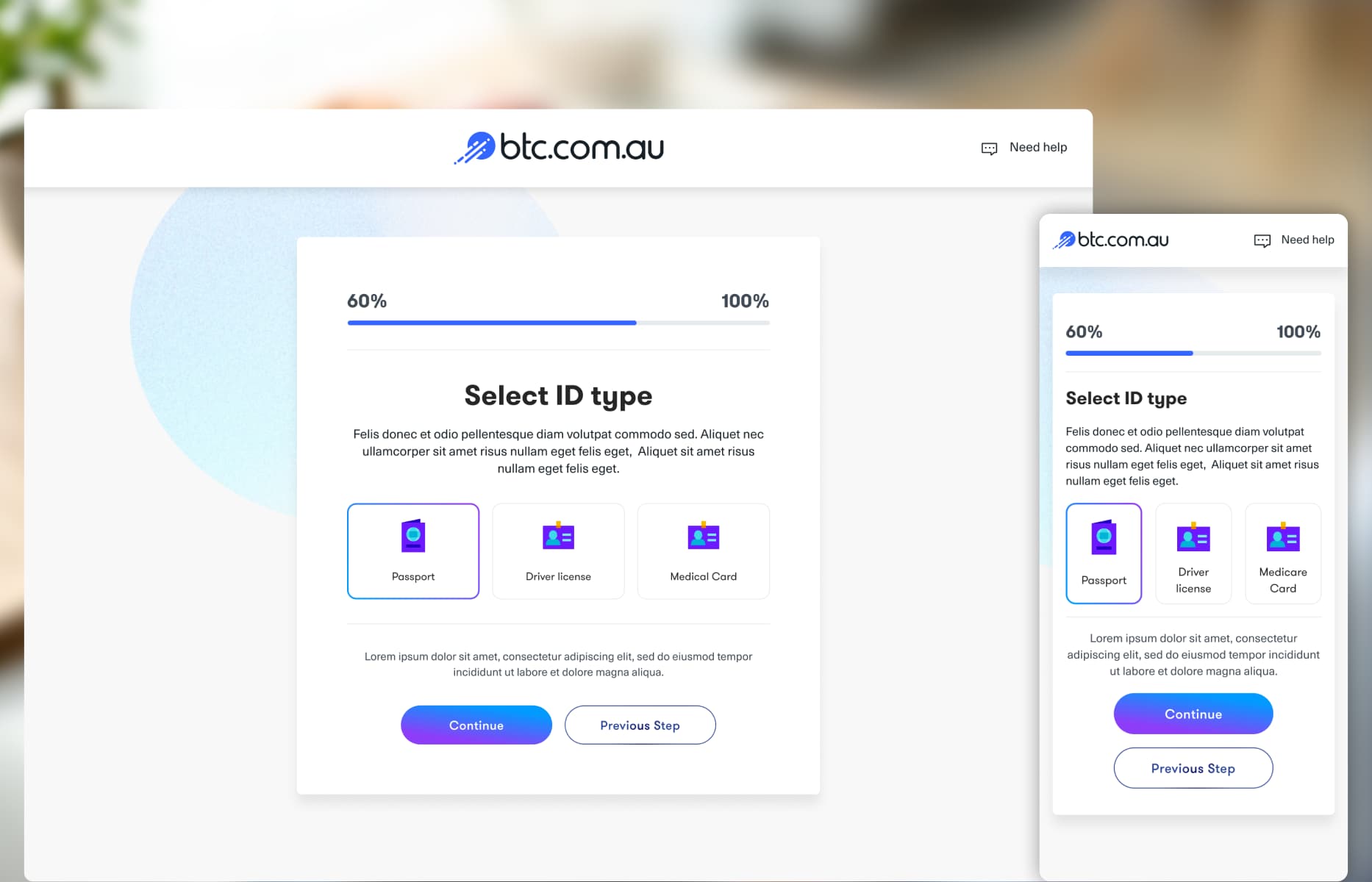
  • Identity verification: Breaking the mandatory process into clear stages with progress, document options and help.

  • UI system: Reusing relevant foundations and adding components for charts, forms, assets, filters and verification.

  • Handoff and QA: Preparing responsive specifications and reviewing the implemented web application and public website.

Designing a dashboard around information priority

The dashboard needed to show market movement, portfolio value, asset allocation and balances without giving everything the same visual weight.

I grouped the interface around three priorities: broader market context, the customer’s portfolio and common account actions. Filters sit beside the charts and data they control, while deposit, withdrawal, exchange and wallet tasks have direct routes outside the overview.
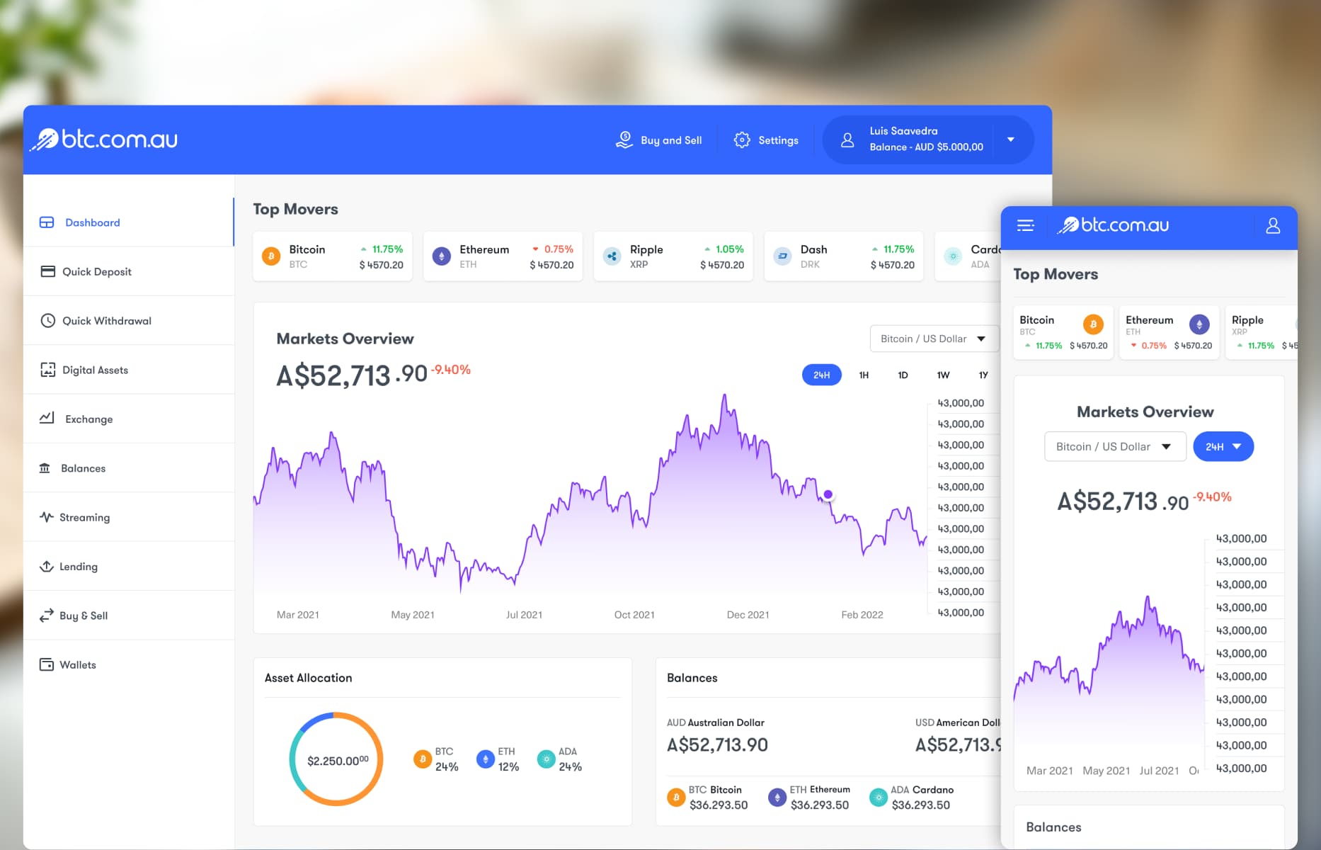
1. Designing a dashboard around information priority

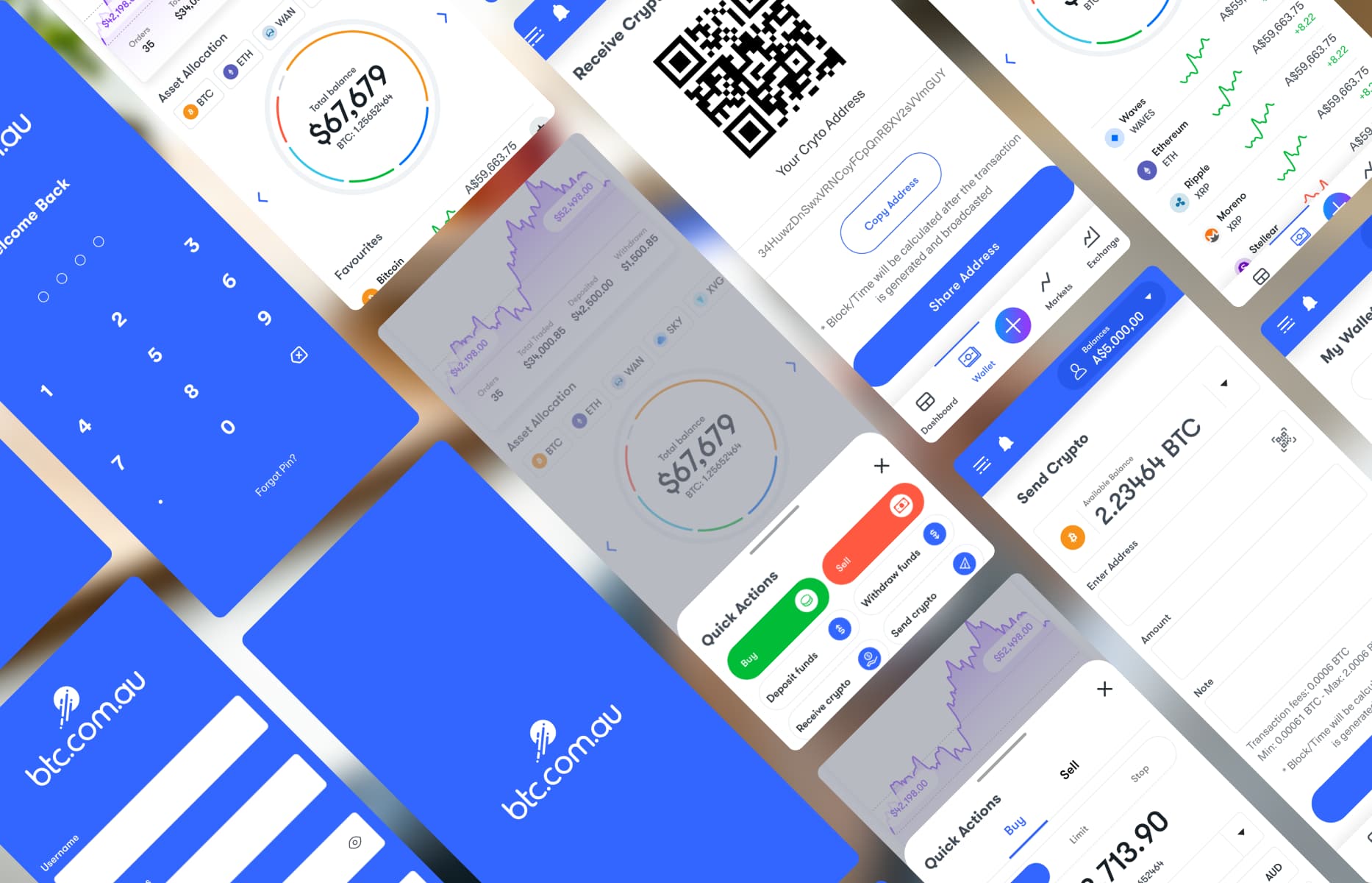
Adapting dashboard complexity for mobile

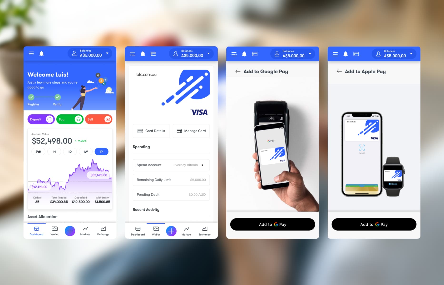
I didn’t treat mobile as a smaller desktop dashboard.

Primary market indicators appear first and supporting information follows in a vertical sequence. Charts, filters and account controls were adjusted for touch, while navigation was simplified around shorter mobile tasks. The interface shares a system with desktop, but changes the order and density of information where needed.

2. Adapting dashboard complexity for mobile

Guiding customers through identity verification

Identity verification—also known as KYC—is mandatory before customers can use a financial platform, but the process can feel uncertain when requirements are unclear.

Working with the Chief Design Officer, I divided document collection into visible stages. Customers could see their progress, choose an accepted Australian document such as a passport, driver licence or Medicare card, and access help throughout the process.

3. Guiding customers through identity verification

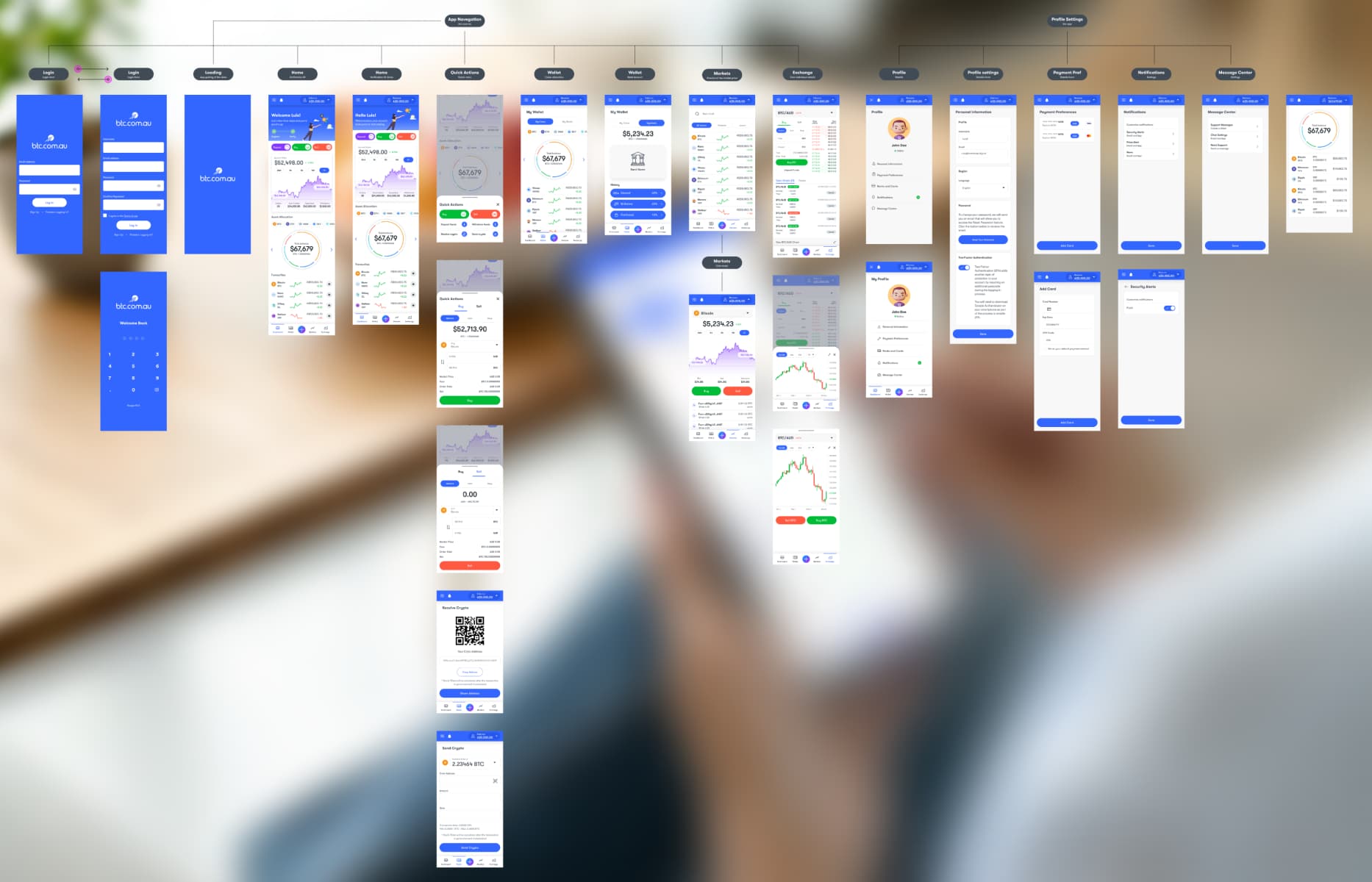
Supporting account and transaction journeys

The dashboard needed to remain useful without becoming the entry point for every detailed task.

I created direct routes into Quick Deposit, Withdrawal, Exchange, Lending and Wallet management. This kept the overview focused on status and market information while giving active customers faster access to deeper account workflows.

4. Supporting account and transaction journeys

Building a system for financial interfaces

Some reusable foundations already existed, so I kept the components that worked and added the patterns the product needed.

These included charts, asset summaries, financial forms, filter bars, account cards and verification steps. I also documented typography, spacing, colour and responsive behaviour so web and mobile could share one system without using identical layouts.

5. Building a system for financial interfaces

Extending the direction beyond the product

The product work later expanded into BTC.com Australia’s public website and supporting digital assets.

I carried the application’s typography, colour, component language and illustration style into the marketing experience. This created a clearer connection between the information customers saw before signing up and the product they used after joining.

6. Extending the direction beyond the product

Handoff and design QA

I prepared responsive Figma specifications, component states and interaction guidance for BTC.com Australia’s internal engineering team. The handoff made the deliberate differences between web and mobile explicit rather than leaving those decisions to interpretation during development.

I stayed involved through design QA for the web application and public website, reviewing responsive behaviour and visual details before release. The internal team managed the application build, including the native mobile implementation.

What reached production

The web application and public website were released through BTC.com Australia’s internal engineering team.

The platform is no longer active, so this case study uses the original design and production material rather than linking to a live product.

What I learned

The project reinforced that simplifying a financial product does not mean removing useful information. The more important task is deciding what customers need first, what belongs close together and what can wait until they ask for it.

It also showed why responsive design is not only about screen size. Desktop and mobile could share the same system while using different navigation, density and content order.

Delivered work

What shipped

A responsive product and public website delivered through BTC.com Australia’s internal engineering team.

A more organised dashboard

Market context, portfolio information and common account actions were separated into clear, scannable sections.

A guided verification flow

Identity verification was divided into visible stages with document choices, progress and help kept close at hand.

One system across platforms

Web and mobile shared the same components and visual language while adapting navigation and information density to each screen.

Connecting constraints to decisions

Challenge → Design response

Each response traces back to a customer, operational or platform constraint.

  1. Challenge

    Market movement, portfolio value, balances and asset allocation all competed for attention on the dashboard.

    Design response

    Establish a clear information hierarchy, use modular data components and place filters close to the information they changed.

  2. Challenge

    Customers needed to provide an accepted identity document before using the platform, creating a potentially high-friction onboarding step.

    Design response

    Divide verification into visible stages, allow customers to select an available document type and keep help and progress information accessible throughout the flow.

  3. Challenge

    First-time crypto customers needed guidance, while experienced users expected quick access to market and account functions.

    Design response

    Use progressive disclosure for onboarding and clear, direct navigation for deposits, withdrawals, assets, exchange activity, balances and account actions.

  4. Challenge

    The product needed to feel coherent across a mobile application and data-rich web interface without forcing identical layouts onto different screen sizes.

    Design response

    Share the visual language, components and interaction principles while changing navigation, module order and information density for each platform.

From ambiguity to delivery

Design process

The process was not strictly linear. Each stage reduced a different kind of risk and informed the next design decision.

  1. Review the existing requirements and study familiar crypto-product patterns for onboarding, identity verification, market information and account management.

  2. Work with the Chief Design Officer to define the main journeys, organise the dashboard and decide what should remain consistent across web and mobile.

  3. Design the responsive journeys and UI system in Figma, reusing useful foundations and adding product-specific components for charts, assets, filters, forms and verification.

  4. Prepare the work for BTC.com Australia’s engineering team and stay involved through design QA on the web application and public website.

Block-style portrait of Luis Saavedra

DIGITAL PRODUCT DESIGNER

I’m Luis Saavedra.

My background in industrial design still shapes how I work: I think of digital products as practical tools that need to be clear, useful and well made. I bring that approach to complex workflows, clean UI and design systems that hold up in production.

  • Product Strategy
  • Design Systems & UI Kits
  • Human-AI Interaction
  • E-Commerce & Mobile Apps
  • User Journeys & Workflows
  • Accessibility & Usability