Reframing the digital experience for high-value equipment
Hastings Deering is one of the world’s largest Caterpillar dealers, supporting mining, construction, and industrial customers across Queensland and the Northern Territory.
Buying heavy machinery is a high-consideration, multi-stakeholder investment. I led the UX/UI design working alongside a Creative Designer to transform how Hastings Deering presents its fleet online. By pairing a confident, automotive-inspired visual direction with progressive technical depth, we built a digital experience that gives high-intent buyers complete clarity and confidence to choose Caterpillar through HD.
The opportunity
Industrial equipment websites often rely on small product images, dense technical specs, and category structures built around internal terminology. While Hastings Deering follows great brand guidelines, their previous digital presence failed to translate that visual strength missing a huge opportunity to connect with buyers.
We saw a clear path to elevate the experience by bringing those strong brand assets to life through modern layout design, giving heavy machinery a commanding presence without compromising the technical depth buyers rely on during high-value decisions.
My role and collaboration
During the five-week high-fidelity design phase, I served as Lead UX/UI Designer, working closely alongside a Creative Designer. While she contributed to the creative concept and led client presentations, I was responsible for end-to-end UX architecture, responsive UI execution, and developer handoff.
My focus remained squarely on the human experience: interpreting customer research, structuring specification hierarchies, adapting our agency's shared e-commerce design system, and delivering detailed Figma specs to development.
What shaped the design
Customer research and business insights revealed four core principles that directly guided our strategy:
Buying is a multi-stakeholder decision: Operators, technical teams, managers, and financial leaders required different data points to evaluate the same machine.
Research spans weeks and months: Buyers frequently compared models, returned with questions, and shared options with colleagues before requesting a quote.
Product value extends beyond the sale: Parts, servicing, warranties, and fleet tracking were essential to long-term customer relationships.
The visual language needed to evolve: Machinery needed a bold, premium presence while fully respecting Caterpillar brand guidelines and asset constraints.
01
Premium equipment presence
Elevating heavy machinery through automotive-inspired design patterns.
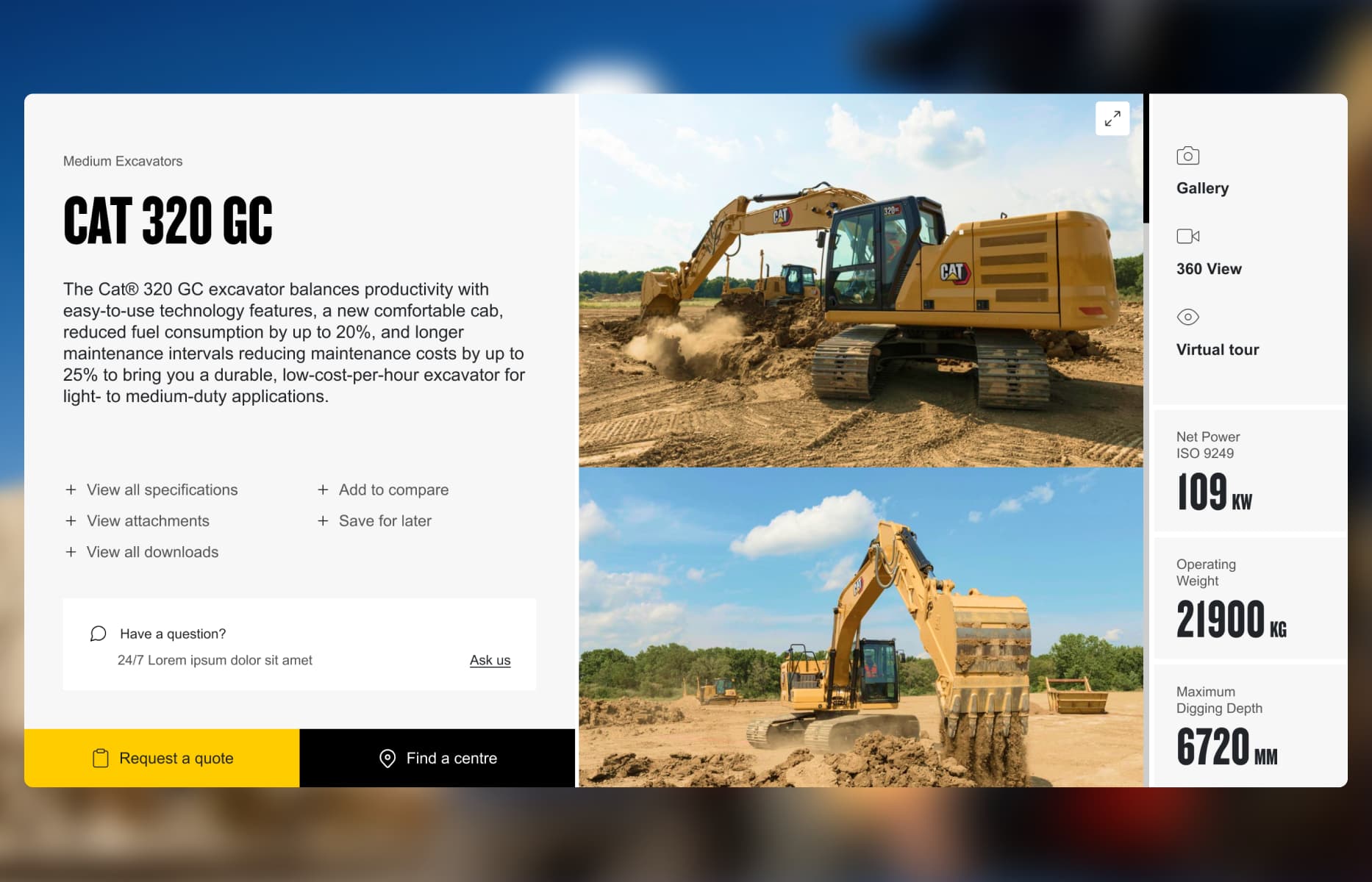
Industrial sites often relegate heavy equipment to small catalogue thumbnails surrounded by wall-to-wall text.
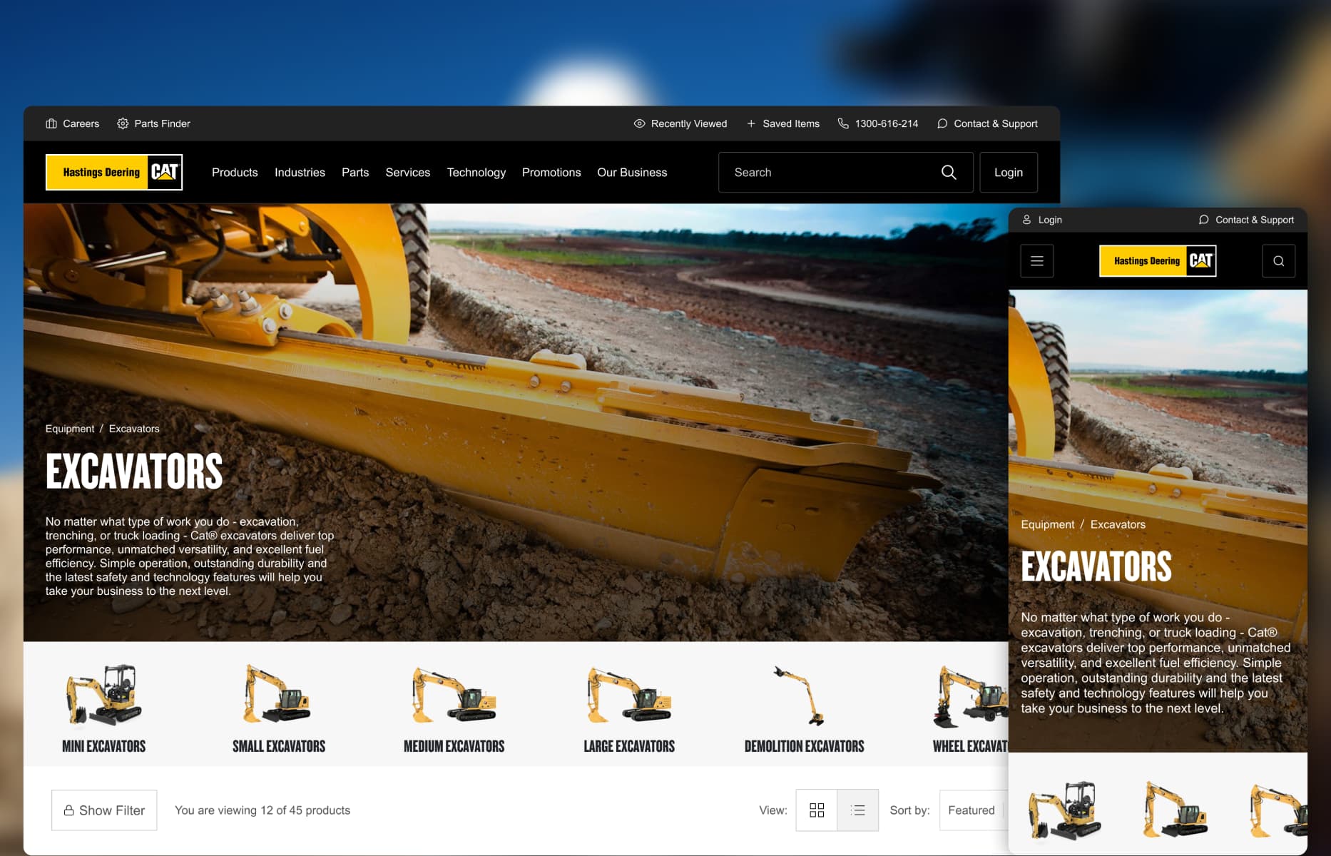
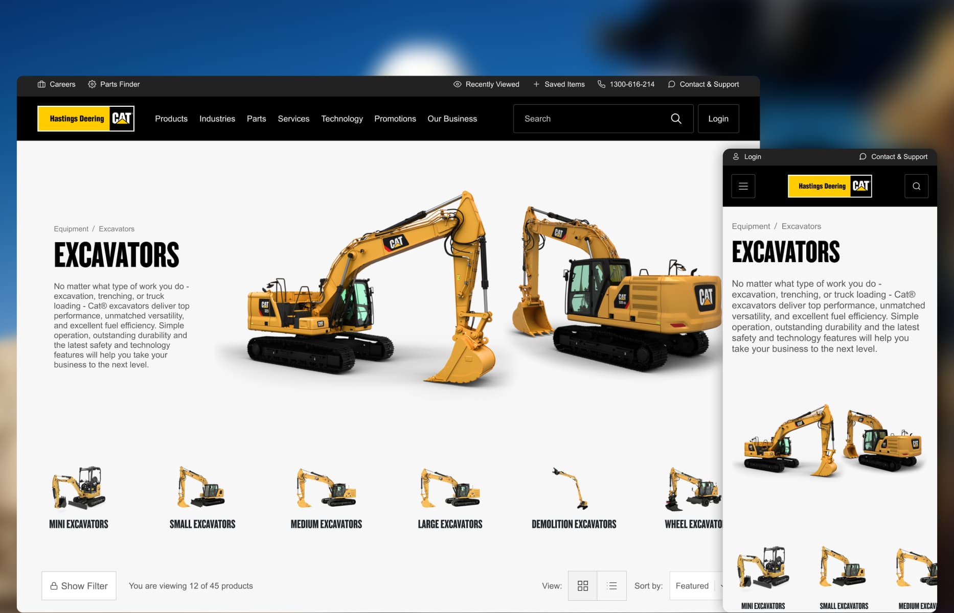
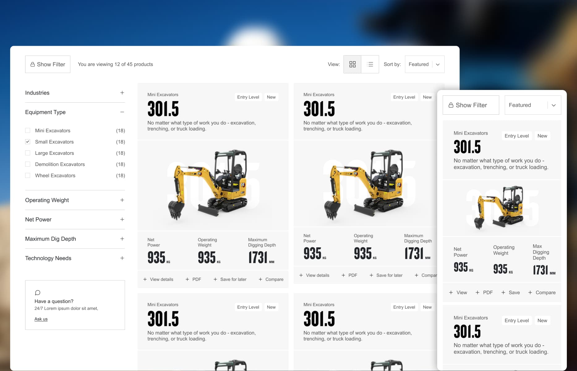
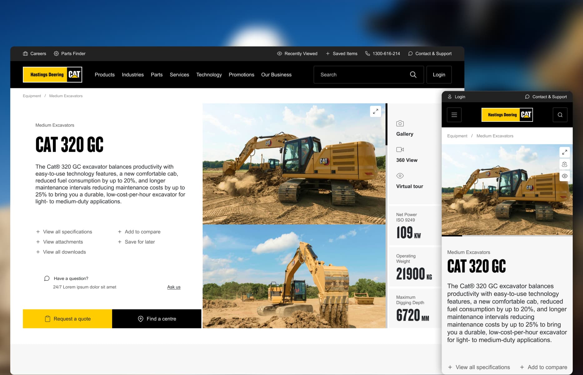
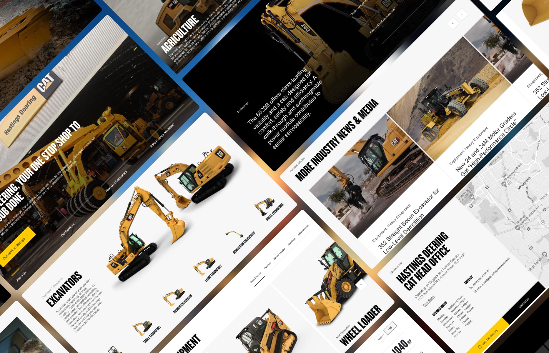
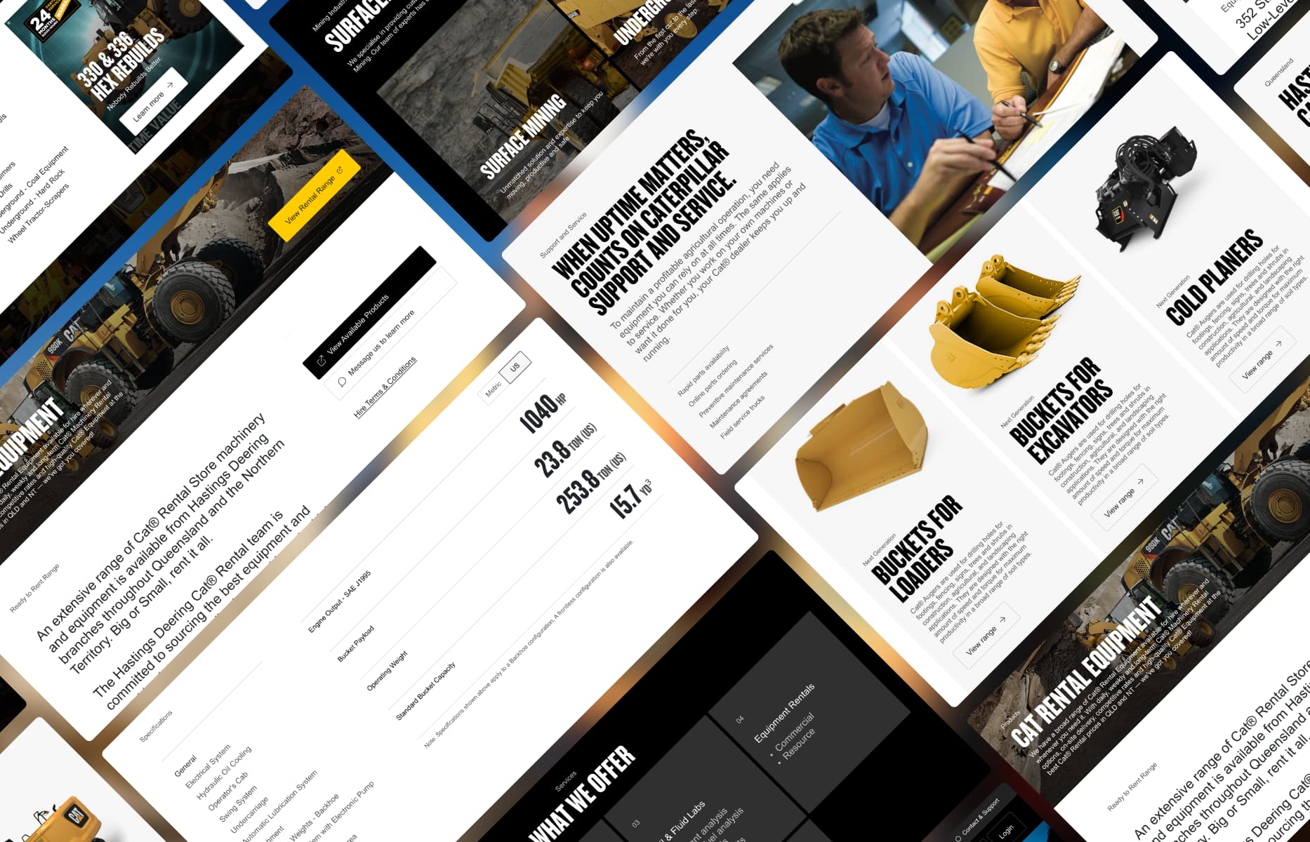
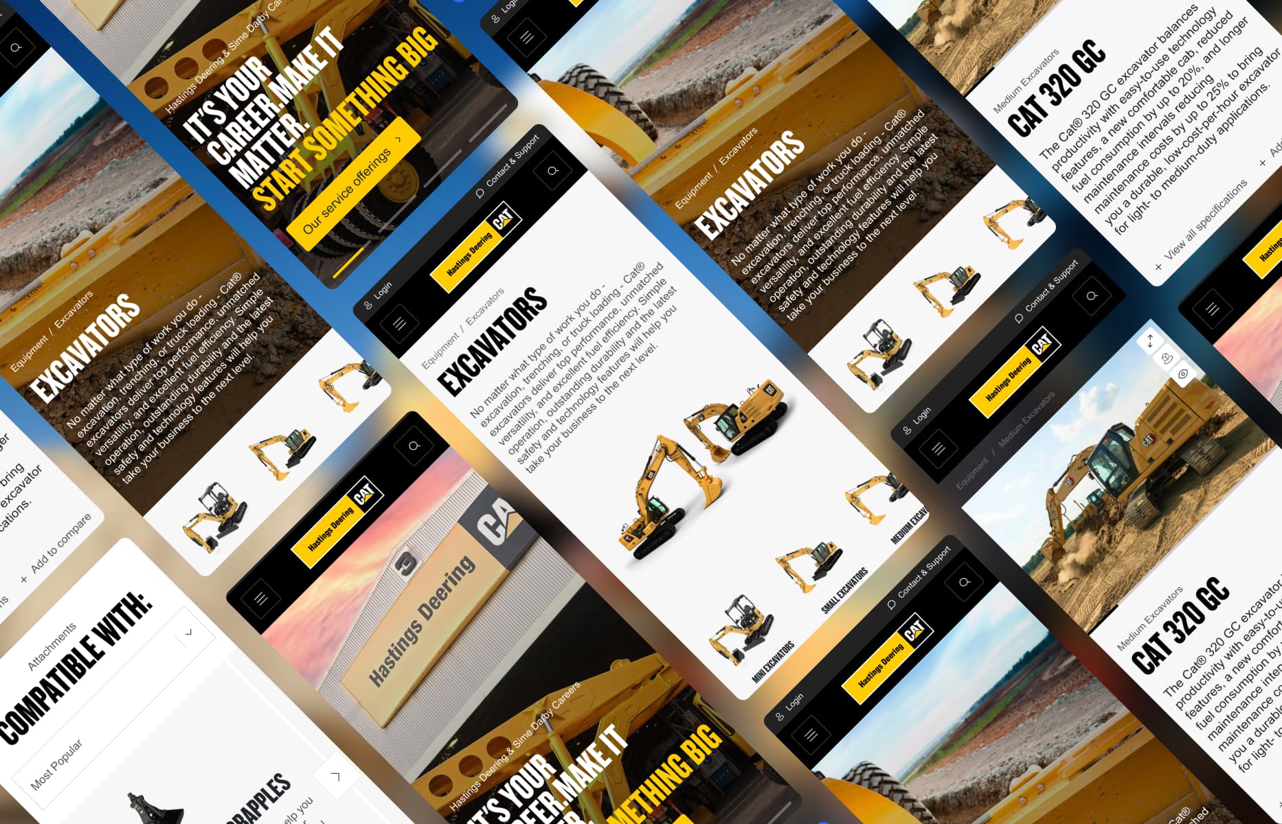
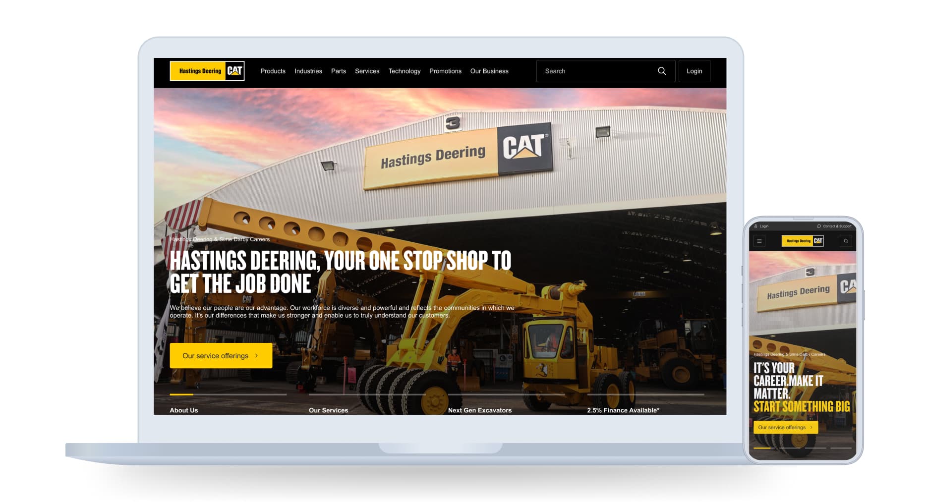
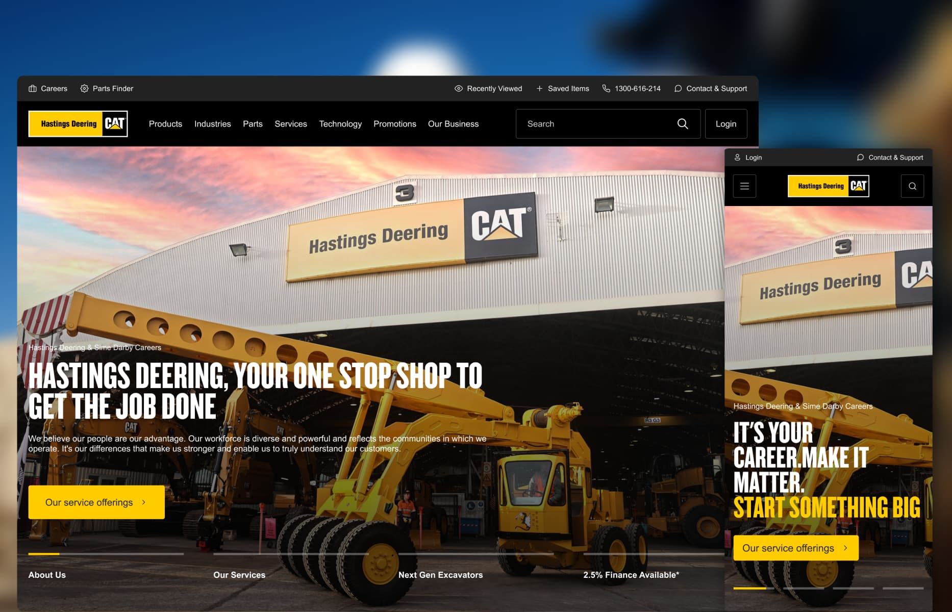
Borrowing principles from high-end automotive experiences like Polestar, I established responsive layouts featuring large-scale machinery imagery, strong typographic hierarchy, and focused Caterpillar brand accents. To overcome asset quality limitations, I designed flexible image containers and controlled cropping rules that gave machines a commanding visual presence without hiding critical specs.
02
Supporting long research cycles
Providing tools to preserve options across complex evaluation phases.
Because buying heavy machinery involves multiple stakeholders over extended timeframes, losing track of evaluated options creates unnecessary friction.
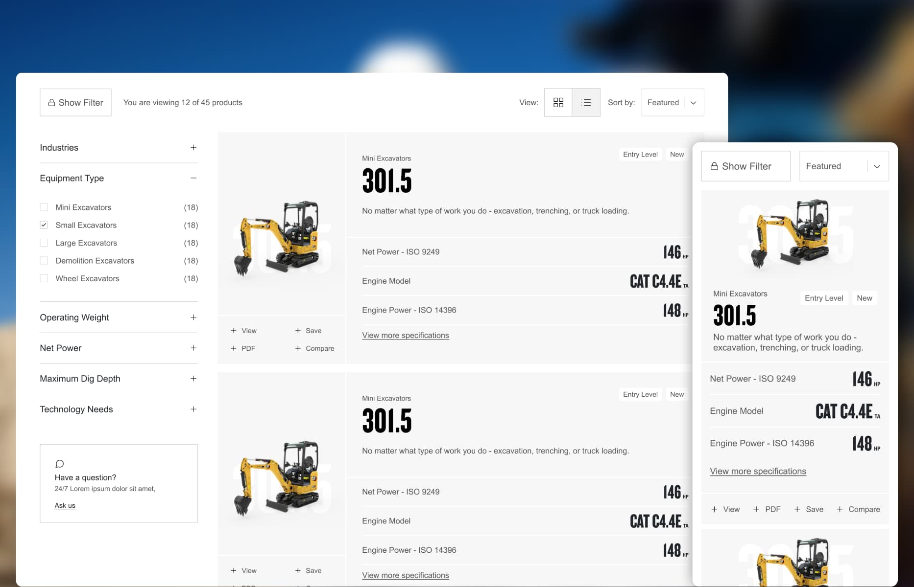
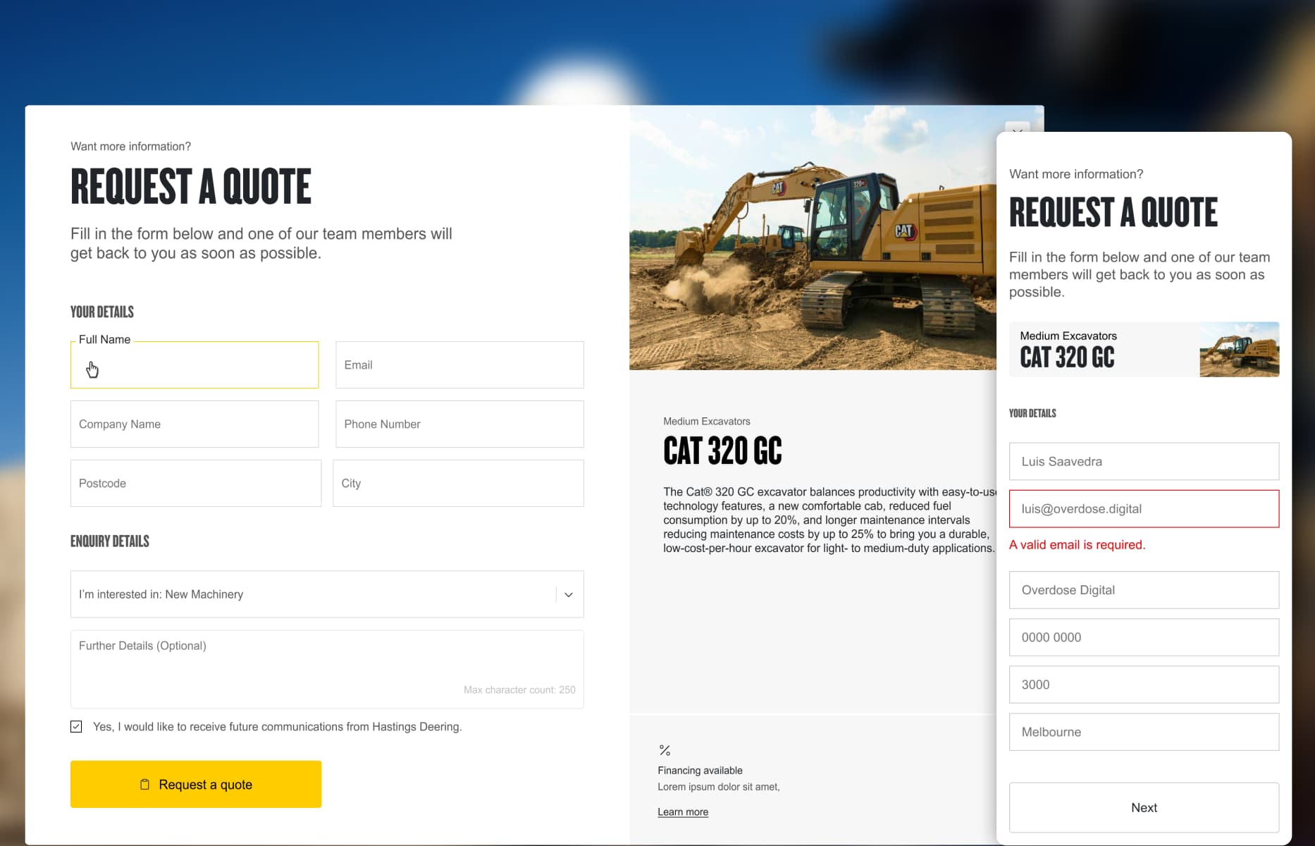
I designed a persistent "Save for later" pattern alongside clear side-by-side product comparison cards. This allowed buyers to retain options, review key specifications at a glance, and share structured comparisons with team members before initiating contact with a local dealer.
03
Progressive technical hierarchies
Structuring dense machinery specifications for diverse buyer mindsets.
A product detail page must serve both an operator looking at cab ergonomics and a fleet manager evaluating hydraulic performance.
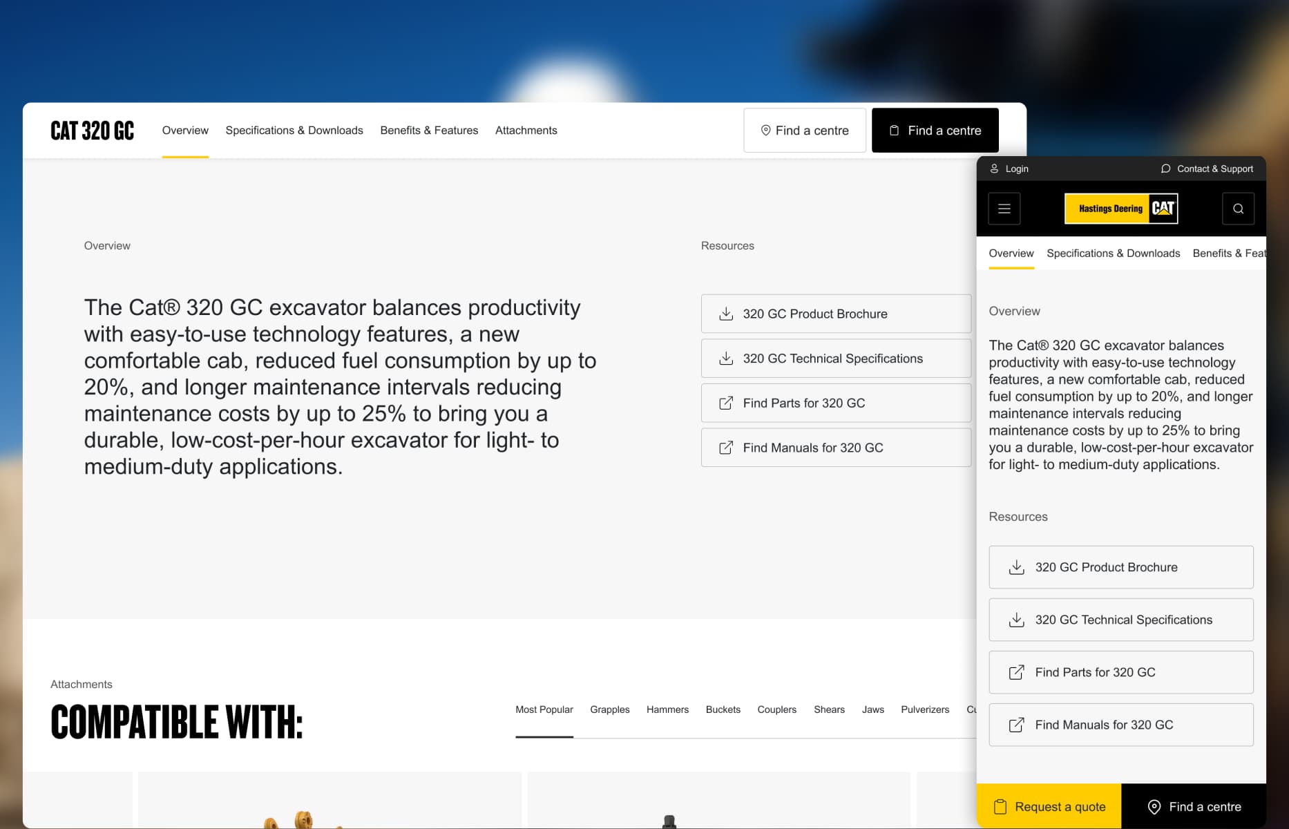
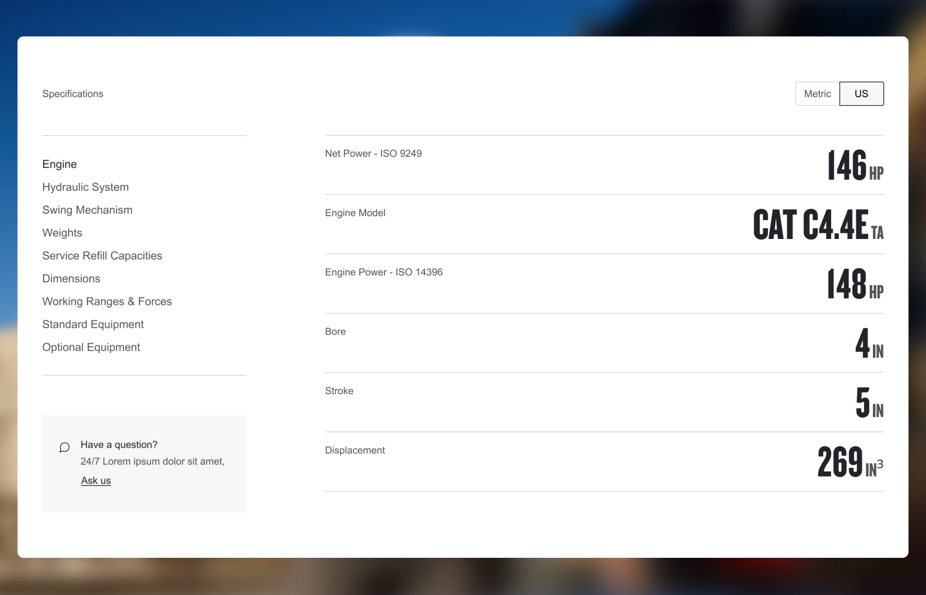
I designed a progressive specification system that categorizes dense technical data into scannable groups such as Engine, Hydraulics, and Dimensions. Key performance figures sit prominently in the summary header, while tabbed spec tables, an imperial/metric unit toggle, and attached resource downloads support deeper technical evaluation.
04
Algolia-powered multi-category search
Connecting buyers directly to machines, parts, and technical resources.
Customers needed to locate specific attachments, parts manuals, and articles without navigating complex internal taxonomy trees.
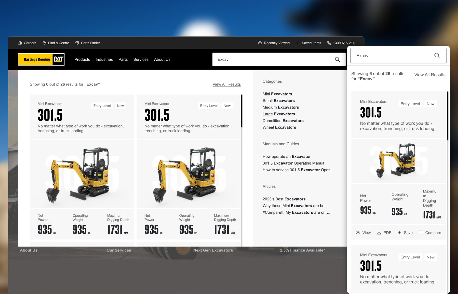
I designed a real-time, predictive search engine powered by Algolia. As users type, the pattern surfaces product results with key specs at a glance, while a contextual sidebar instantly provides pathways to matching attachments, support documentation, and nearby service centers.
05
Connecting the ownership journey
Bridging initial equipment discovery with long-term fleet management.
The customer relationship only begins at checkout; keeping machines operational is where long-term business value lives.
I gave parts, servicing, and warranties prominent visibility throughout the buyer journey. I created clear pathways connecting product pages to HD360 Hastings Deering’s customer portal allowing fleet owners to easily track parts orders, review service, and manage machine accounts.
06
Scalable design system adaptation
Customizing a shared e-commerce UI kit to heavy industrial standards.
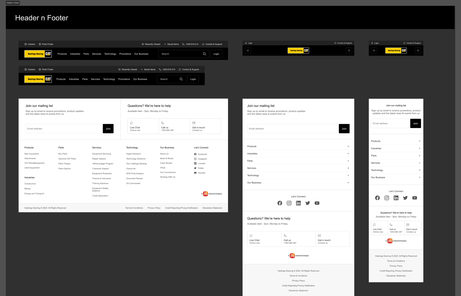
To maintain consistency across a massive product catalogue, I adapted our agency's core e-commerce design system to Caterpillar’s visual identity. Using Figma components and flexible variants, I built repeatable UI specs for equipment cards, specification grids, search patterns, and responsive layouts giving engineering a clean, reliable foundation for implementation.
Creative collaboration and exploration
Uncovering proven online patterns to solve high-intent buyer challenges.
To move beyond text-dense industrial layouts, I collaborated with a Creative Designer during agency ideation to analyze benchmark B2B, automotive, and heavy equipment platforms. While she established the elevated visual concept and led client presentations, I synthesized our insights into responsive UX architecture translating Hastings Deering’s brand guidelines into detailed Figma specs, component variants, and intuitive discovery flows for engineering.
What I learned
This project reinforced that a premium visual experience and technical depth do not need to compete. The key was to reveal information progressively: give the machine enough space to establish value, surface the specifications that support initial comparison and provide deeper detail when each stakeholder needs it.
It also showed the importance of designing around the full ownership lifecycle. For Hastings Deering customers, selecting a machine was connected to attachments, parts, maintenance, service and long-term fleet management. Treating those needs as one experience produced a more useful structure than designing a product catalogue alone.
Interface in context
UI Gallery
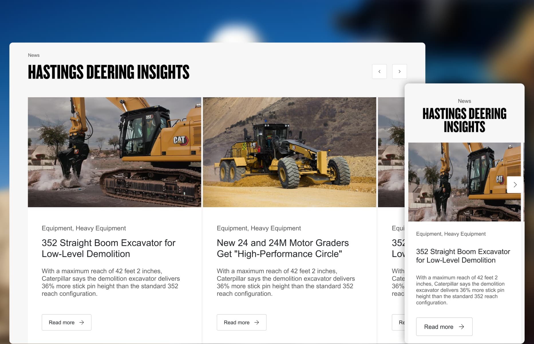
Selected screens showing how the experience translates key decisions into a clear, consistent interface.
Outcome and evidence
Impact and validation
A clearer customer journey, a stronger operational foundation, and a system designed to give buyers confidence.
01
A more confident product presence
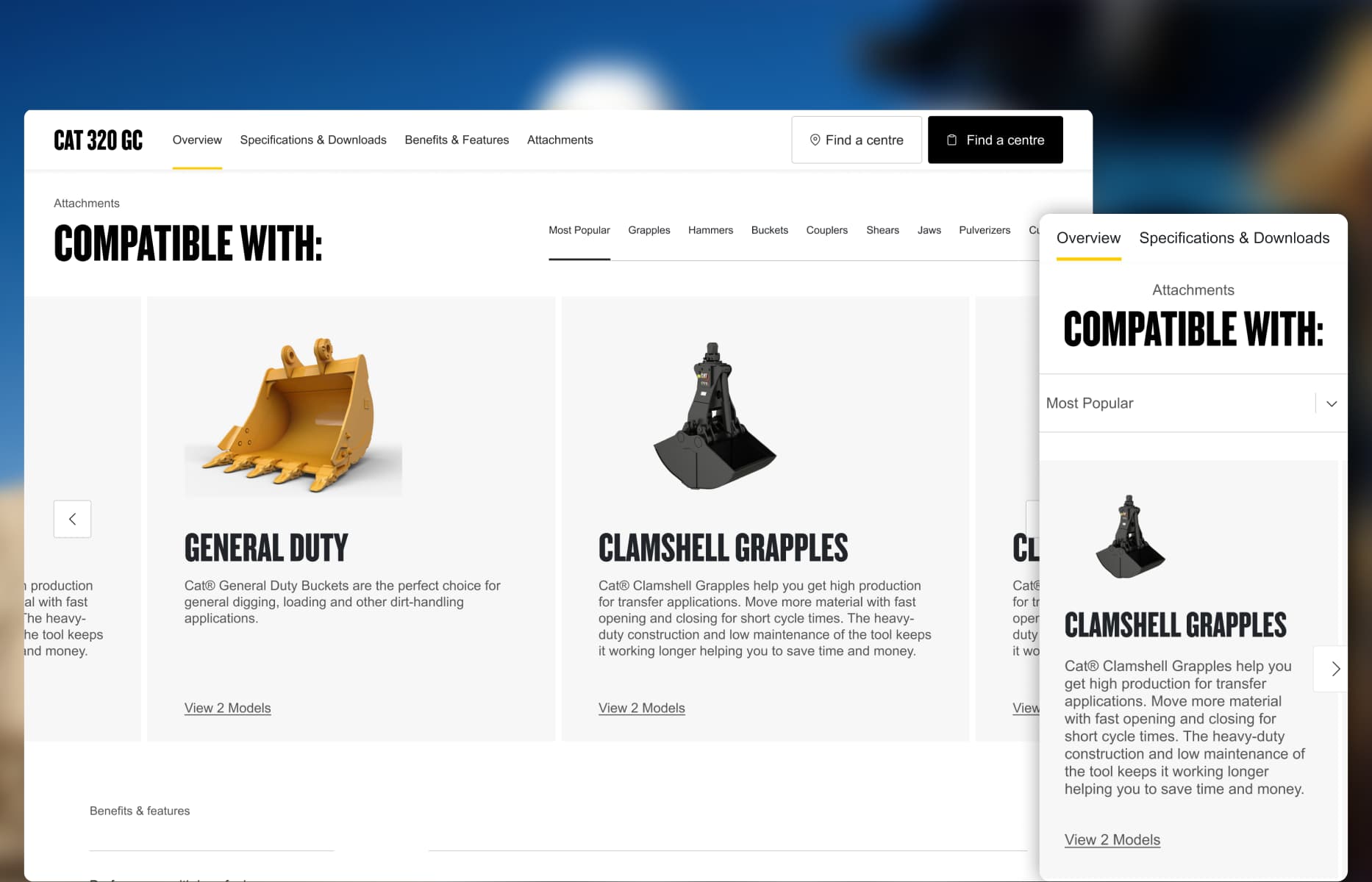
The interface gave heavy equipment more visual importance while keeping specifications, attachments and resources accessible.
02
Better continuity during research
Save and comparison patterns allowed buyers to retain relevant options and continue a high-consideration decision across visits.
03
Clearer information for different roles
Operators, technical teams, managers and financial stakeholders could move between concise summaries and detailed product information according to their needs.
Connecting constraints to decisions
Challenge → Design response
Each response traces back to a customer, operational or platform constraint.
01
Challenge
Small images and dense layouts made the machinery feel like catalogue entries instead of significant business investments.
→
Design response
Use larger imagery, focused layouts and confident typography to give each machine more presence while retaining clear access to technical details.
02
Challenge
Equipment research happened across several visits and involved operators, technical teams, managers and financial stakeholders.
→
Design response
Introduce save and comparison patterns so teams could retain relevant machines, review options and return without restarting their research.
03
Challenge
Buyers needed specifications, attachments, documents, maintenance and support information at different levels of detail.
→
Design response
Organise information into scannable summaries, grouped specification tabs and clearly labelled resources, allowing each role to reach the depth it required.
04
Challenge
Customers also needed to find parts, service and tools for managing machines and orders after a sale.
→
Design response
Make parts and support easier to discover and create visible paths to services such as HD360 within the wider equipment lifecycle.
From ambiguity to delivery
Design process
The process was not strictly linear. Each stage reduced a different kind of risk and informed the next design decision.
01
Understand and reviewed the customer research and business information supplied by Hastings Deering, then identified the audiences, buying considerations, and support needs the website had to address.
02
Frame and worked with the Creative Designer during ideation to define a premium visual direction and prioritize equipment discovery, technical evaluation, saved products, comparison, search, and sales contact.
03
Design the journeys and system by creating responsive product listing and detail experiences in Figma, adapting shared e-commerce components, and building client-specific variants for complex industrial content.
04
Deliver by preparing the high-fidelity interface, component specifications, and responsive behavior for development, then clarifying design intent during handoff.
1 / 1
DIGITAL PRODUCT DESIGNER
I’m Luis Saavedra.
My background in industrial design still shapes how I work: I think of digital products as practical tools that need to be clear, useful and well made. I bring that approach to complex workflows, clean UI and design systems that hold up in production.
.jpg?g-8201f4f4)