Web design case study

Redesigning AIGI’s digital presence to empower Indigenous governance

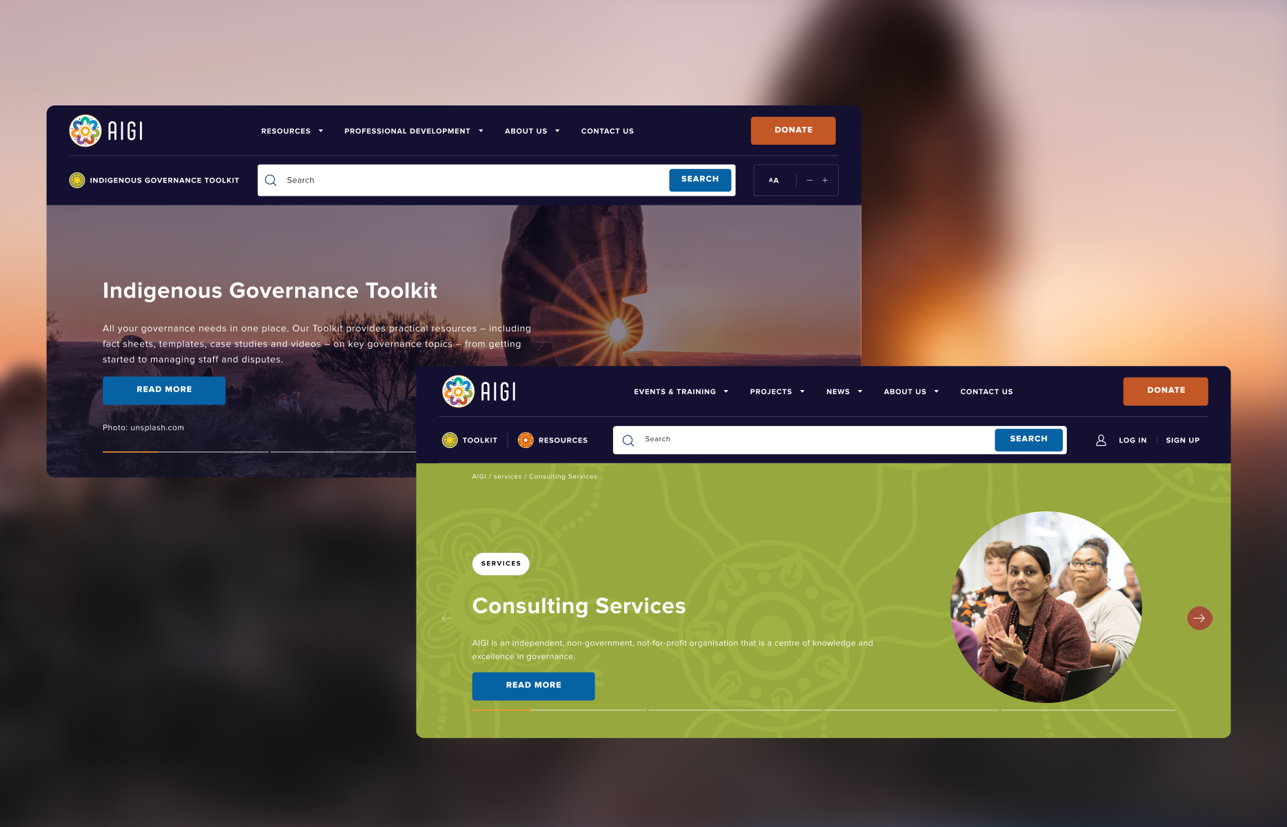
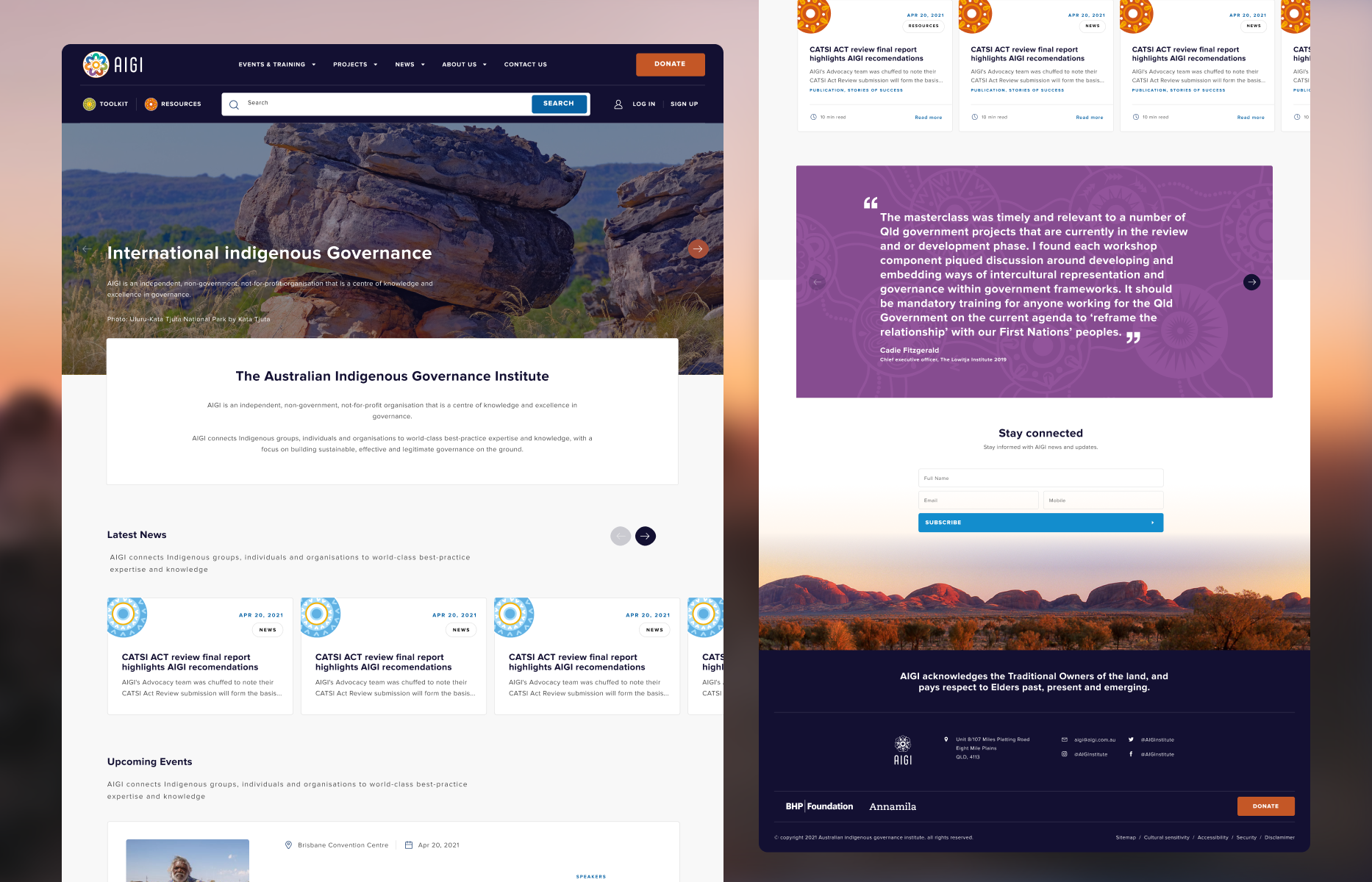
The Australian Indigenous Governance Institute (AIGI) supports Indigenous self-determination by strengthening community governance across Australia. Their existing website wasn’t serving this vital mission dense, text-heavy content was difficult to navigate, and the visual design felt disconnected from their cultural values and community impact.

The opportunity

Community governance frameworks contain critical, non-negotiable cultural knowledge that cannot simply be edited down. However, legacy layouts created walls of text that overwhelmed users, while low-resolution historical imagery and rigid typography built barriers for elders and community members with diverse accessibility needs.

The new digital experience needed to honor Aboriginal and Torres Strait Islander culture while transforming dense educational resources into an intuitive, accessible, and community-centered platform.

My role and collaboration

As UX/UI Designer across a 4-week engagement in 2021, I worked directly with the AIGI team to translate their cultural guidelines and educational frameworks into a modern, accessible web experience.

While AIGI provided the core governance knowledge and community guidelines, my focus remained squarely on the human-centered design execution:

  • Content hierarchy and structure: Restructuring dense educational assets into scannable, approachable user flows without losing critical cultural context.
  • Accessibility-first UI: Designing dynamic typography scaling models and high-contrast layouts to support elders and diverse community reading needs.
  • Respectful visual framing: Designing layered, textured image containers to dignify low-resolution historical community media.
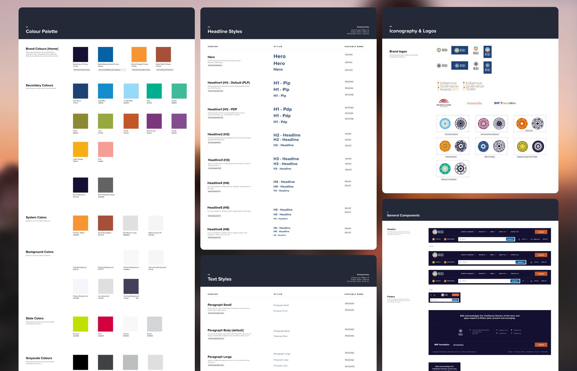
  • Scalable design system: Building modular Figma components and page templates to empower AIGI’s internal team to manage and expand resources independently.

Key design decisions

Making heavy content actually readable

Restructuring dense governance frameworks into scannable, approachable journeys.

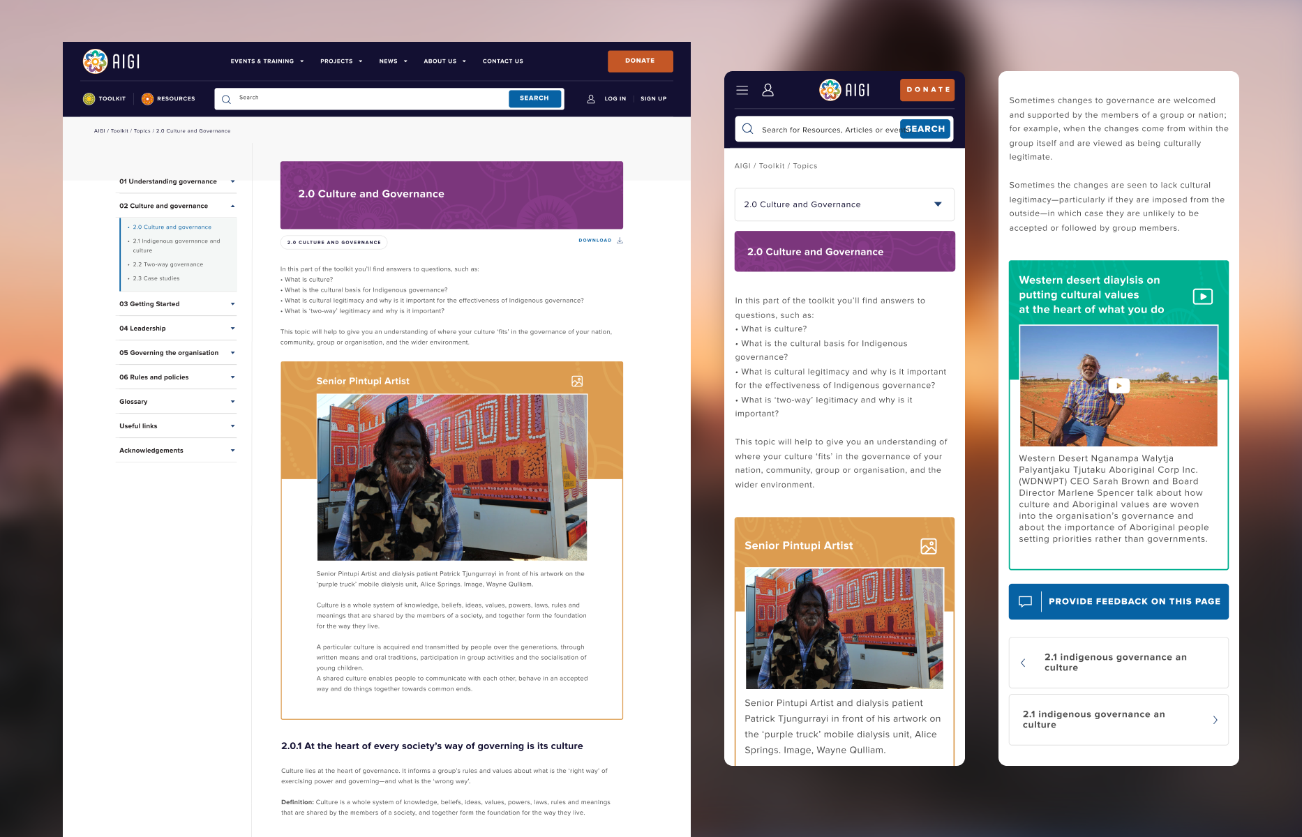
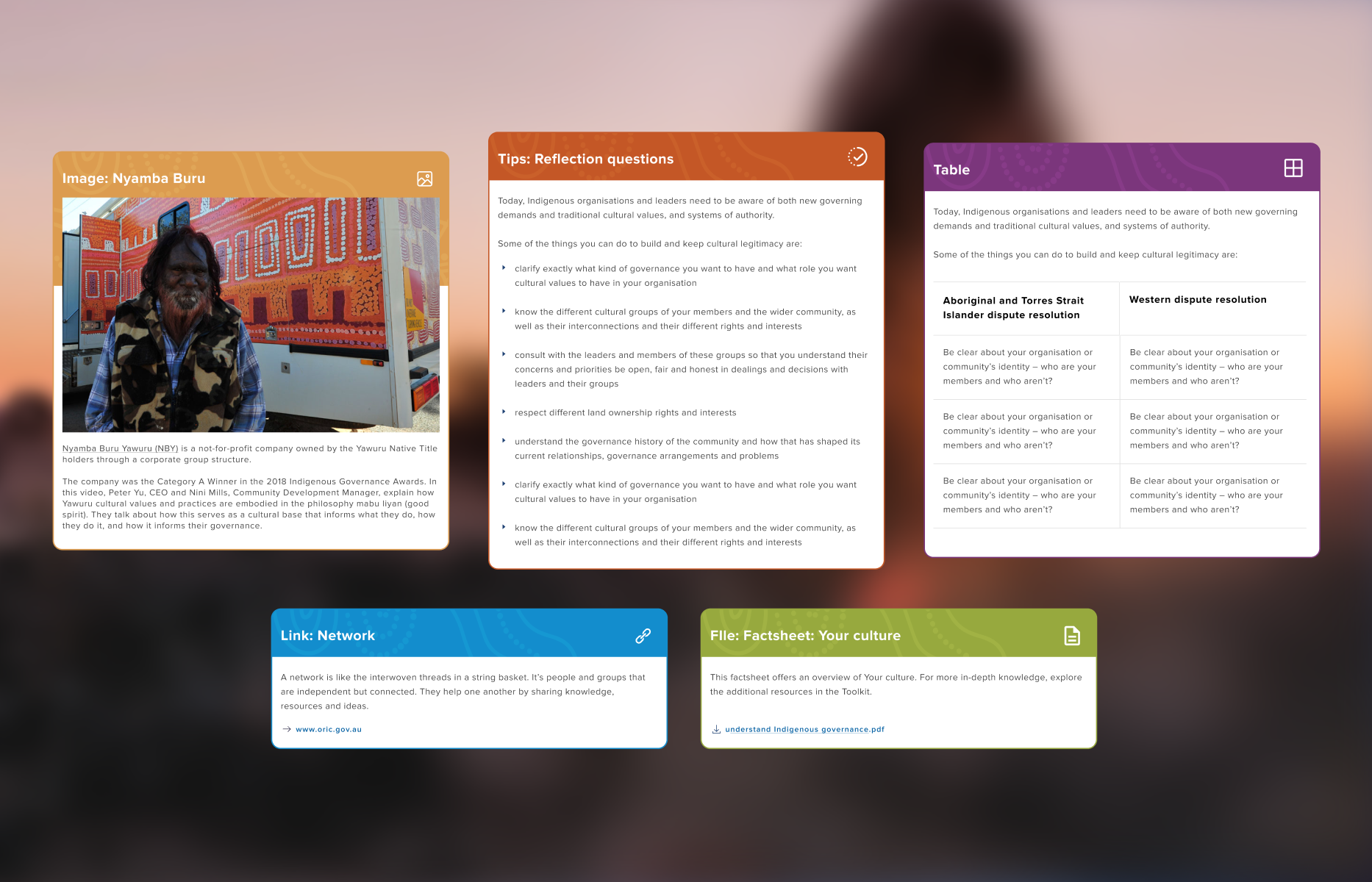
AIGI’s content is detailed and culturally non-negotiable it couldn't simply be cut down. Instead of overwhelming users with walls of text, I established clear headings, scannable section breaks, and generous whitespace. This allows community members to locate specific governance tools and training materials effortlessly.
1. Making heavy content actually readable

Accessibility that actually works

Designing fluid interaction patterns for diverse community demographics.

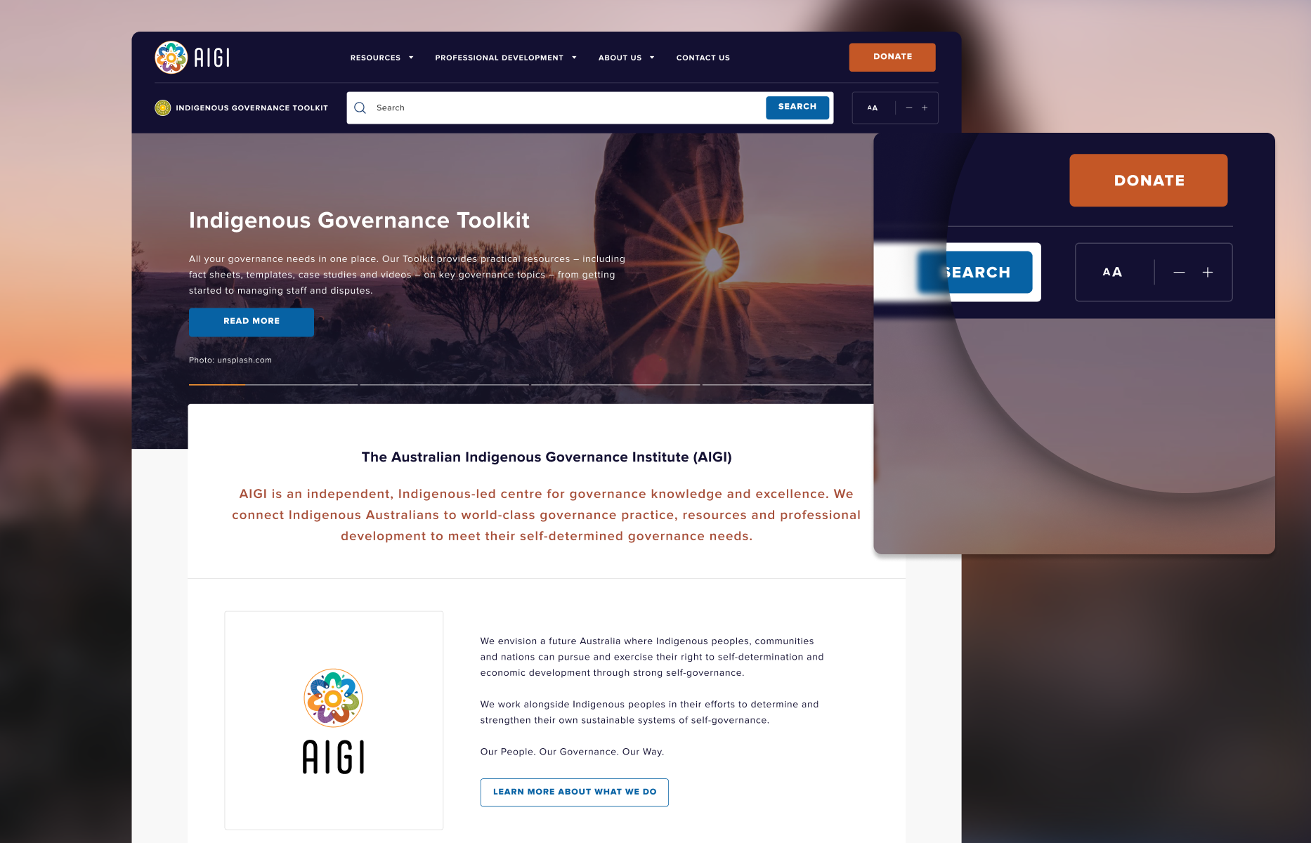
Serving elders and users across varying digital literacy levels required more than standard compliance. I engineered built-in, dynamic text controls that allow users to scale typography sizes up or down without breaking page layouts or visual alignment.

2. Accessibility that actually works

Honoring historical imagery

Elevating low-resolution media through respectful framing components.

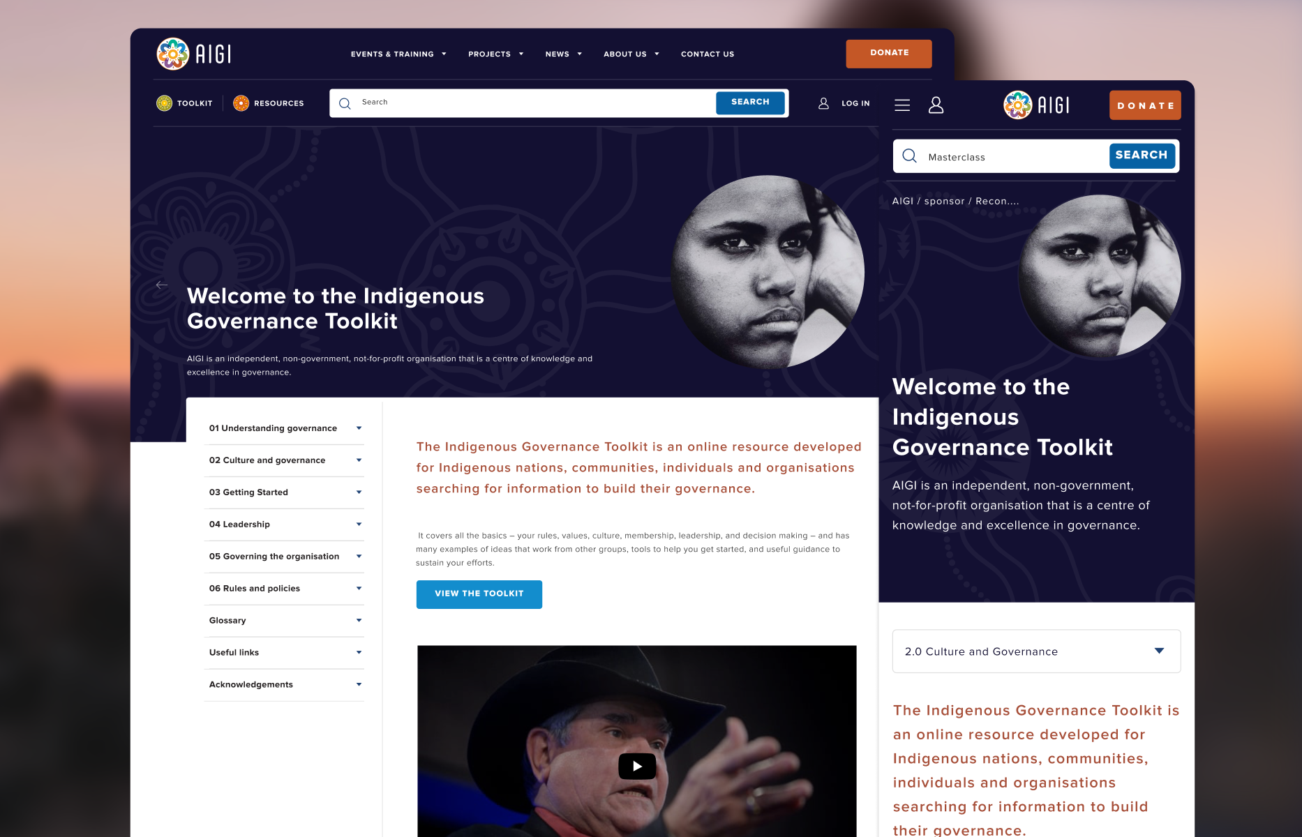
Many of AIGI’s most culturally significant community photos are low-resolution. Rather than replacing them with generic stock photography, I designed textured banner components and layered visual framing that give historical media a dignified, intentional presence across the site.

3. Honoring historical imagery

Handoff and production

I prepared structured Figma UI specifications, component tokens, and responsive layout guidelines for AIGI’s development team. The handoff clearly documented how dynamic text controls, navigation behaviors, and responsive breakpoints should perform in code, giving engineering a clear foundation to build upon.

What I learned

Accessibility is empathy in practice: True accessibility goes beyond meeting formal compliance checklists it’s about designing flexibilities (like dynamic typography scaling) that accommodate real community needs, such as elders reading on small screens.

Constraints drive creative solutions: Working with low-resolution historical imagery showed that visual constraints don't require compromise; thoughtful design patterns and textured framing can elevate imperfect assets into meaningful visual highlights.

Outcome and evidence

Impact and validation

A respectful digital platform, a stronger operational foundation, and a system designed to give community members confidence.

A more respectful digital presence

Established by combining culturally informed visual design with flexible framing components that dignify historical community media.

Enhanced content accessibility

Provided dynamic text scaling and scannable content hierarchies, enabling elders and community members to navigate dense governance resources effortlessly.

A scalable community system

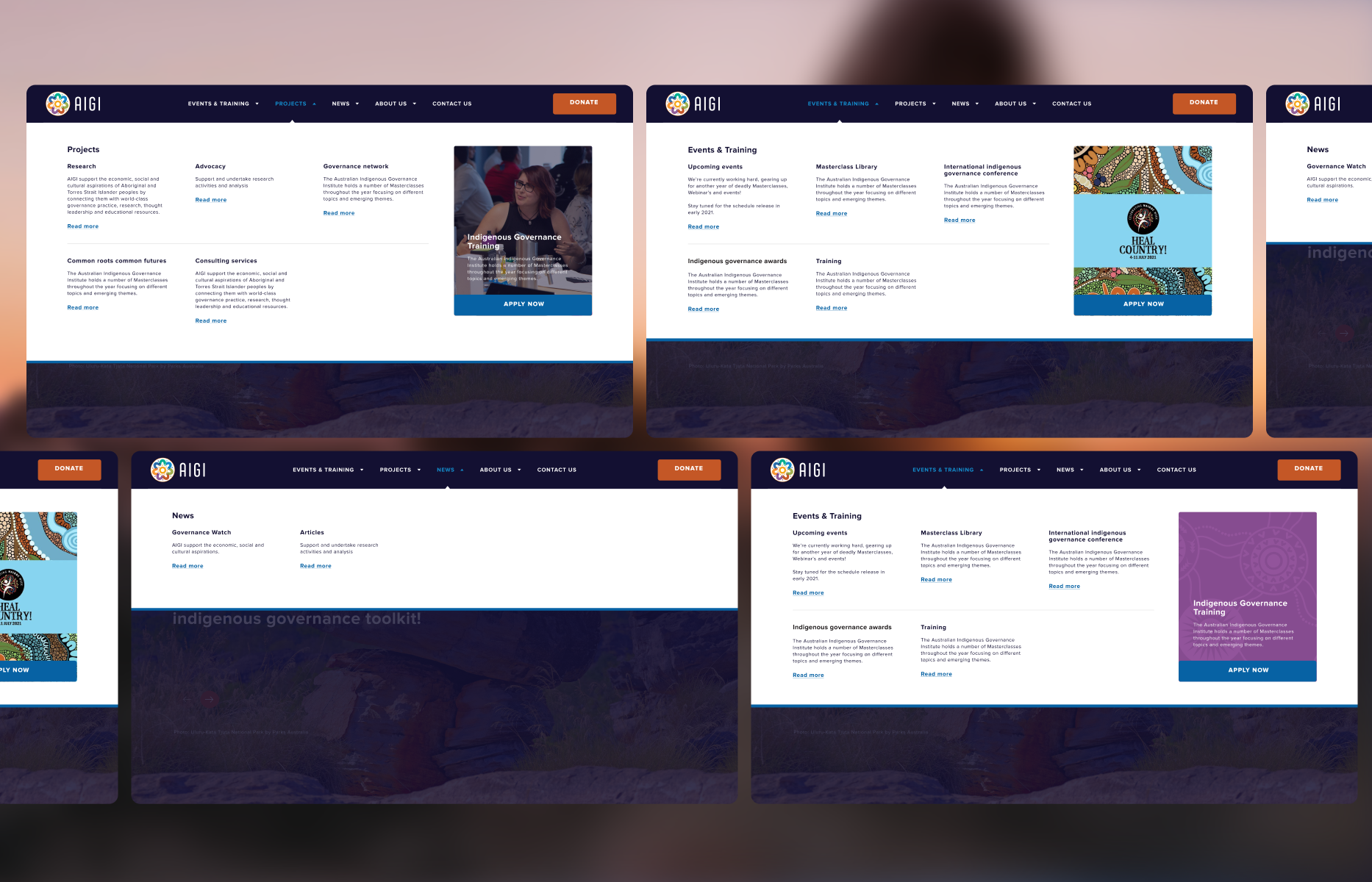
Built on a flexible design system and clear navigation architecture, giving AIGI’s internal team the tools to expand educational resources independently.

Connecting constraints to decisions

Challenge → Design response

Connecting cultural, community, and operational constraints directly to interface solutions.

  1. Challenge

    Heavy, essential governance text could not be cut down without losing critical cultural context.

    Design response

    Restructured content into modular, scannable sections with strong typographic hierarchy and generous whitespace.

  2. Challenge

    Diverse community demographics included elders requiring flexible text scaling and high readability.

    Design response

    Built fluid UI components with native dynamic text controls that enlarge fonts cleanly without breaking page layouts.

  3. Challenge

    Historically significant community media was often low-resolution or pixelated.

    Design response

    Created layered, textured banner containers and respectful visual framing that give low-res media a dignified look.

  4. Challenge

    The internal team needed to maintain and expand complex educational resources easily.

    Design response

    Engineered a component-based design system in Figma, establishing reusable templates for resources, navigation, and content pages.

From ambiguity to delivery

Design process

The process was not strictly linear. Each stage reduced a different kind of risk and informed the next design decision.

  1. Culturally-informed research involved studying community governance materials and establishing culturally respectful visual standards alongside the AIGI team.

  2. Content hierarchy mapping structured dense educational and training assets into scannable, intuitive user flows for various community roles.

  3. Accessibility-first design established dynamic typography models, high-contrast UI states, and touch-friendly navigation patterns.

  4. Modular component development built a unified Figma design system, creating repeatable templates and media cards for long-term scalability.

  5. Collaborative stakeholder workshops validated the design direction with AIGI leaders to ensure cultural alignment and ease of internal maintenance.

Block-style portrait of Luis Saavedra

DIGITAL PRODUCT DESIGNER

I’m Luis Saavedra.

My background in industrial design still shapes how I work: I think of digital products as practical tools that need to be clear, useful and well made. I bring that approach to complex workflows, clean UI and design systems that hold up in production.

  • Product Strategy
  • Design Systems & UI Kits
  • Human-AI Interaction
  • E-Commerce & Mobile Apps
  • User Journeys & Workflows
  • Accessibility & Usability