Recipe Pages That Inspire Action
I made layouts simple (prep time/difficulty/servings upfront), added print/share buttons, and designed natural product showcases—inspiring recipes and ingredient purchases.
Web design case study
Chantal Organics, a family-owned New Zealand business, had recently revitalised their brand identity to embody their commitment to wholesome, sustainable food. With this refreshed vision in place, they were ready to evolve their digital presence into an experience that truly reflected their warm, handcrafted ethos. Their goal: create a digital destination where customers could discover recipes, explore products, and feel inspired to embrace conscious living.
Working in harmony with their new visual identity, I designed an immersive digital experience that puts their organic lifestyle philosophy front and centre. The result? A seamless journey from recipe inspiration to product exploration—making it effortless for users to connect with Chantal’s down-to-earth approach to nourishing food and sustainable living.
I centered the entire design process on translating Chantal’s handcrafted, organic soul into tangible digital interactions. The founder’s vision—"create something her daughter would love"—became my creative compass, guiding every decision from typography to photography.
These highlights showcase how I translated Chantal’s handcrafted soul into purposeful digital experiences—each solving a specific user need to bring their organic, family-driven values to life online.
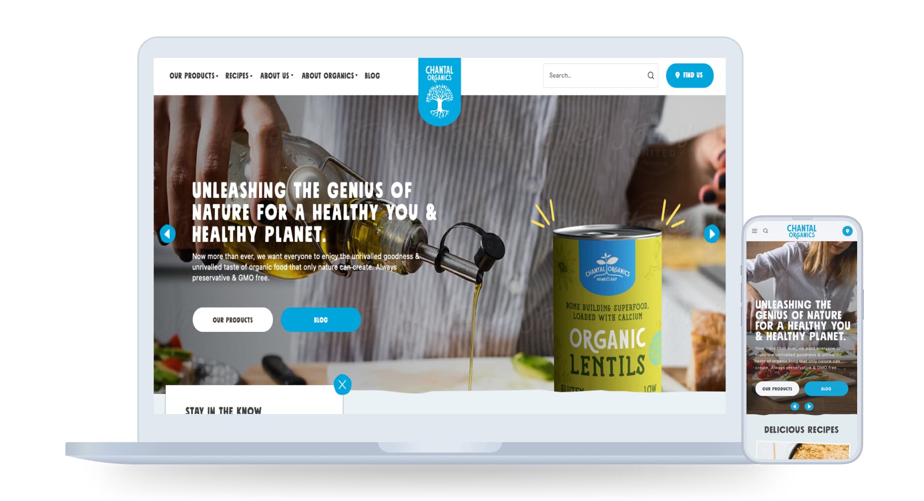
I made layouts simple (prep time/difficulty/servings upfront), added print/share buttons, and designed natural product showcases—inspiring recipes and ingredient purchases.
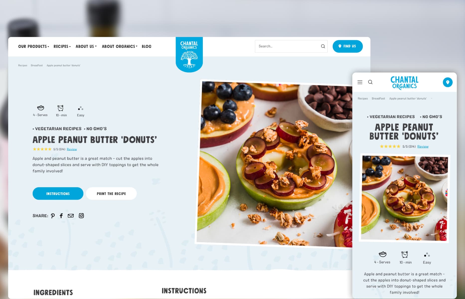
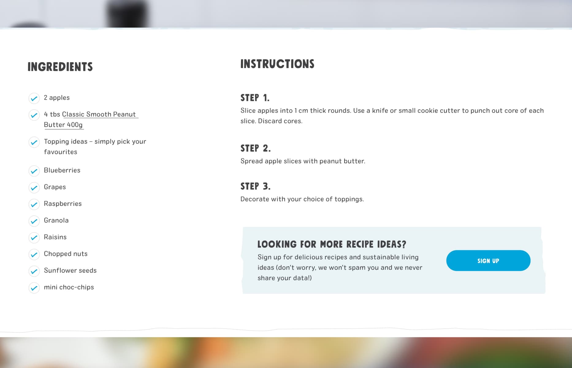
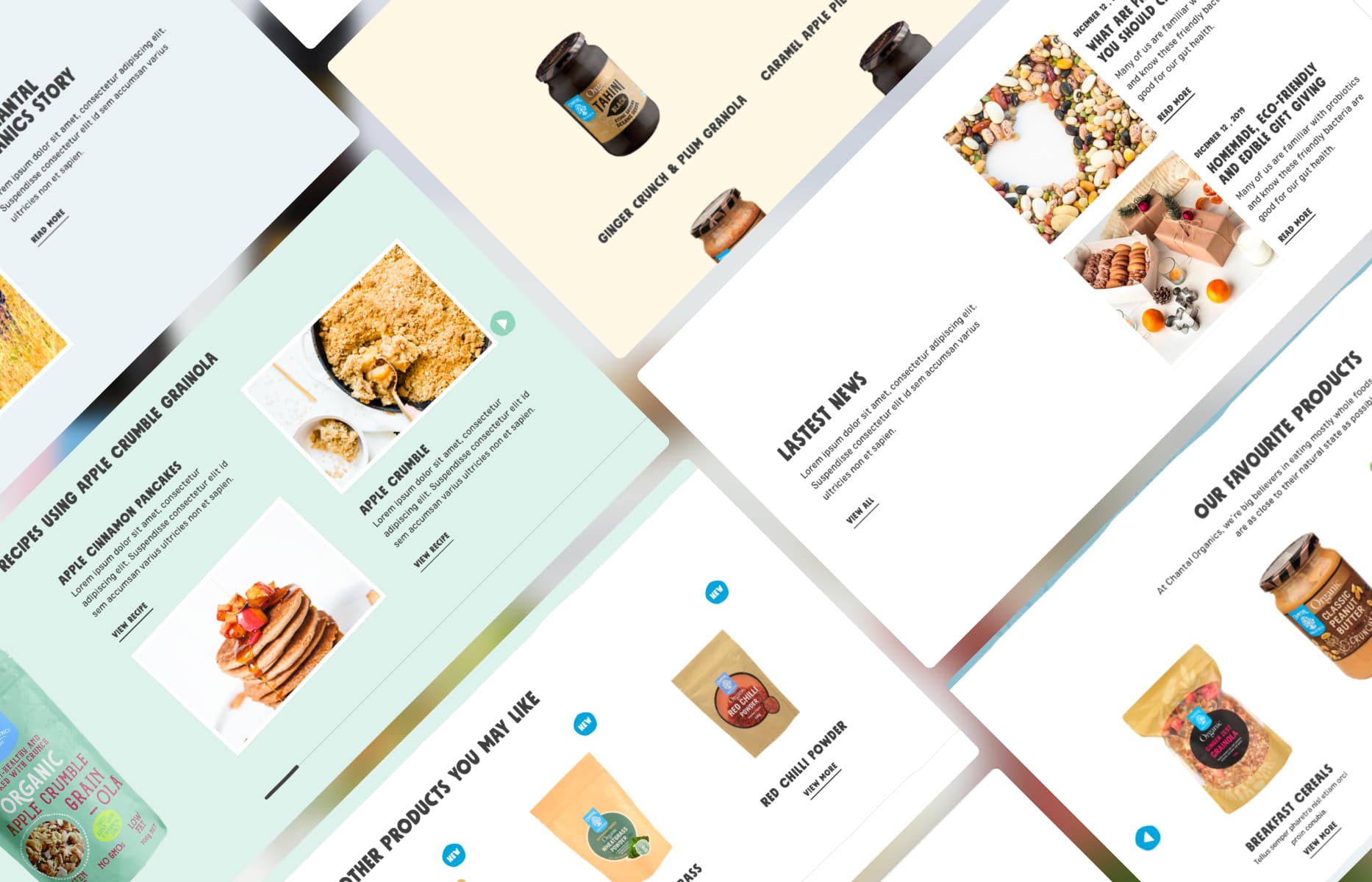
I created recipes that come alive in real kitchens: from a list of ingredients to links to Chantal's products page, a step-by-step guide explaining how to prepare the recipe, and simple "Looking for more recipe ideas?" messages that keep users coming back, turning casual visitors into loyal followers.
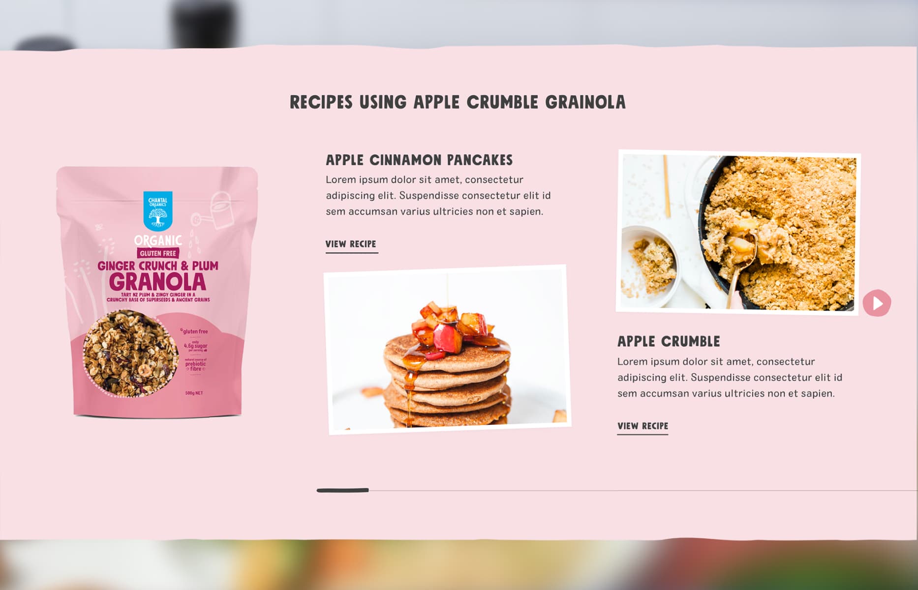
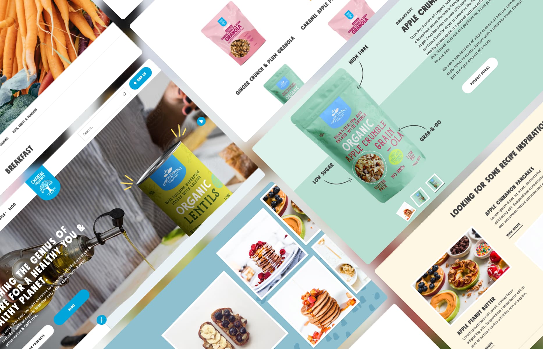
Take their Ginger Crunch & Plum Granola—I put the recipe on the side and showed different ways to use the product. It helps people realize one product can work in breakfast, snacks, or desserts. Bold text and soft backgrounds make it easy to scan, and the playful images make you want to try everything.RetryClaude can make mistakes. Please double-check responses.
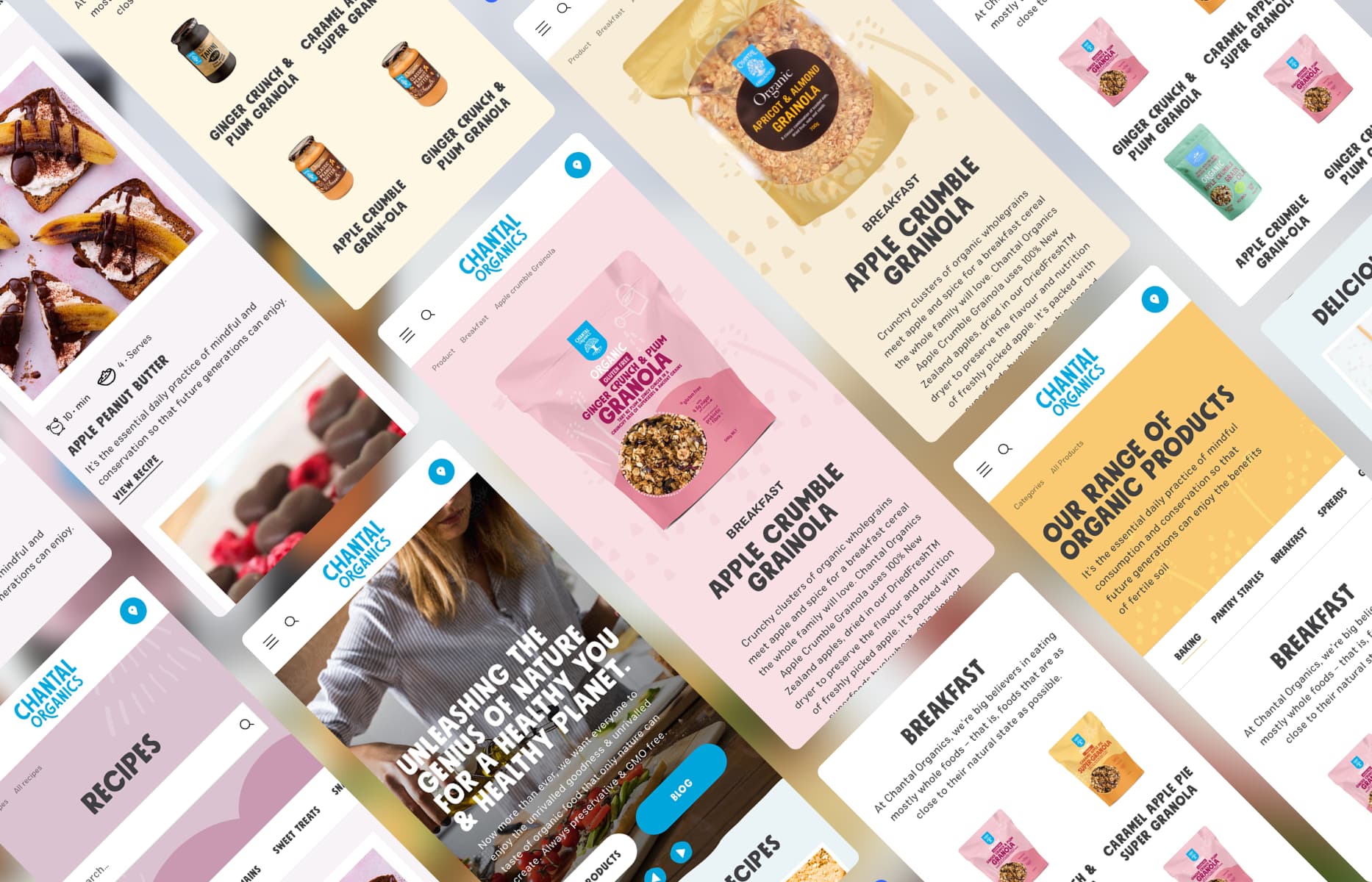
I used the same soft pinks, greens, blues, and peaches from Chantal's packaging. The whole site feels warm and a bit playful—like it was designed with kids in mind (which it was, based on the founder's daughter). It's more like browsing a beautiful cookbook than shopping on a boring website.
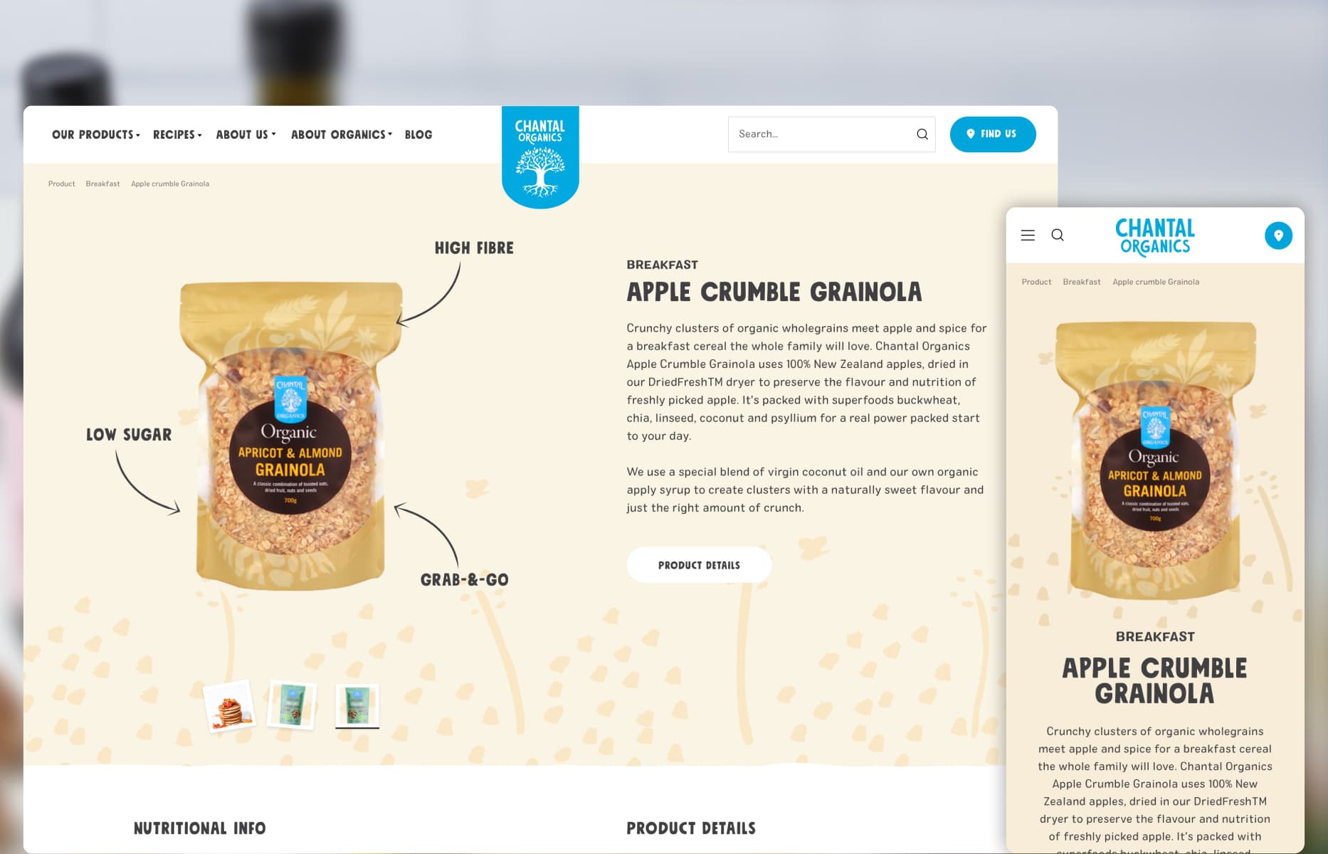
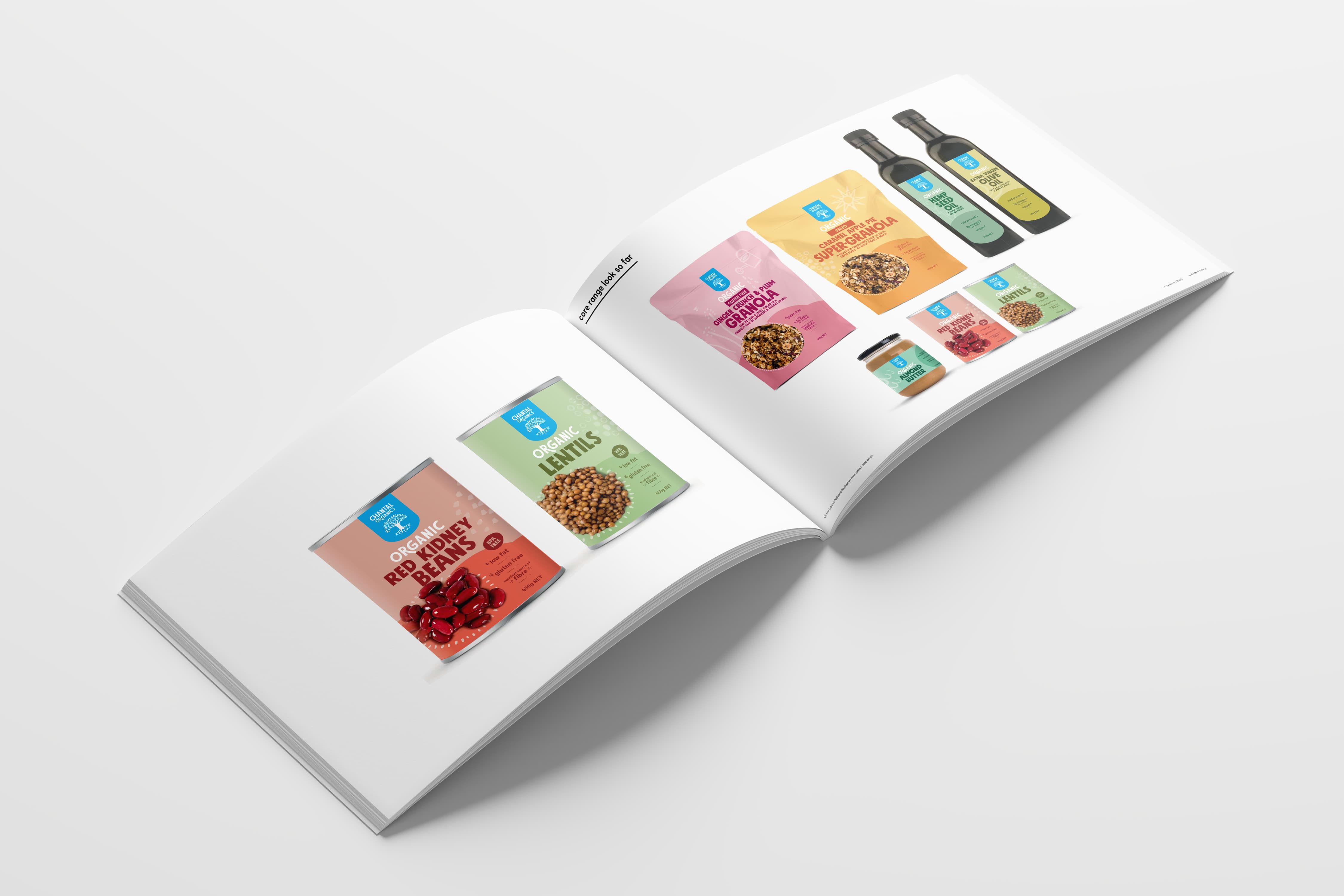
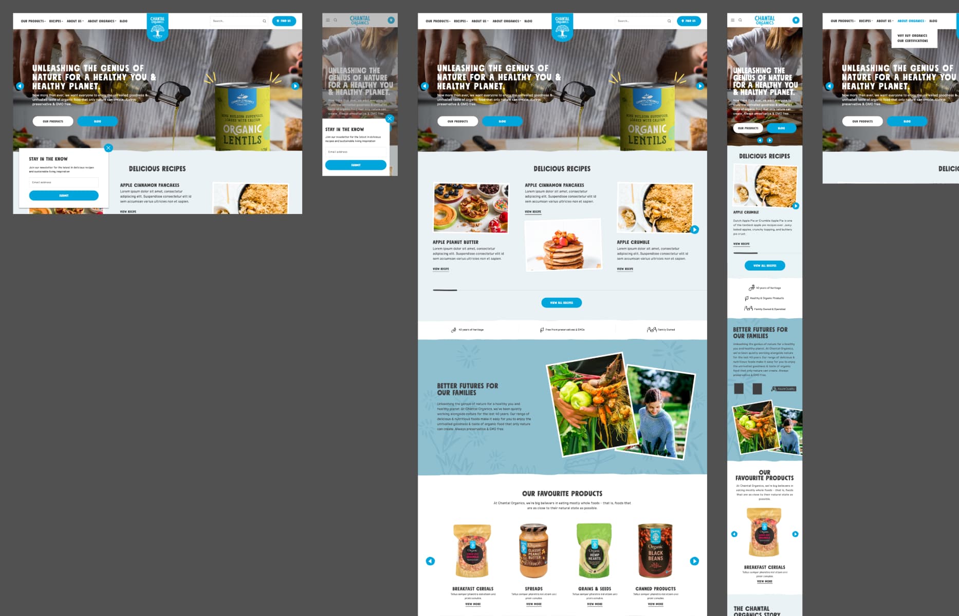
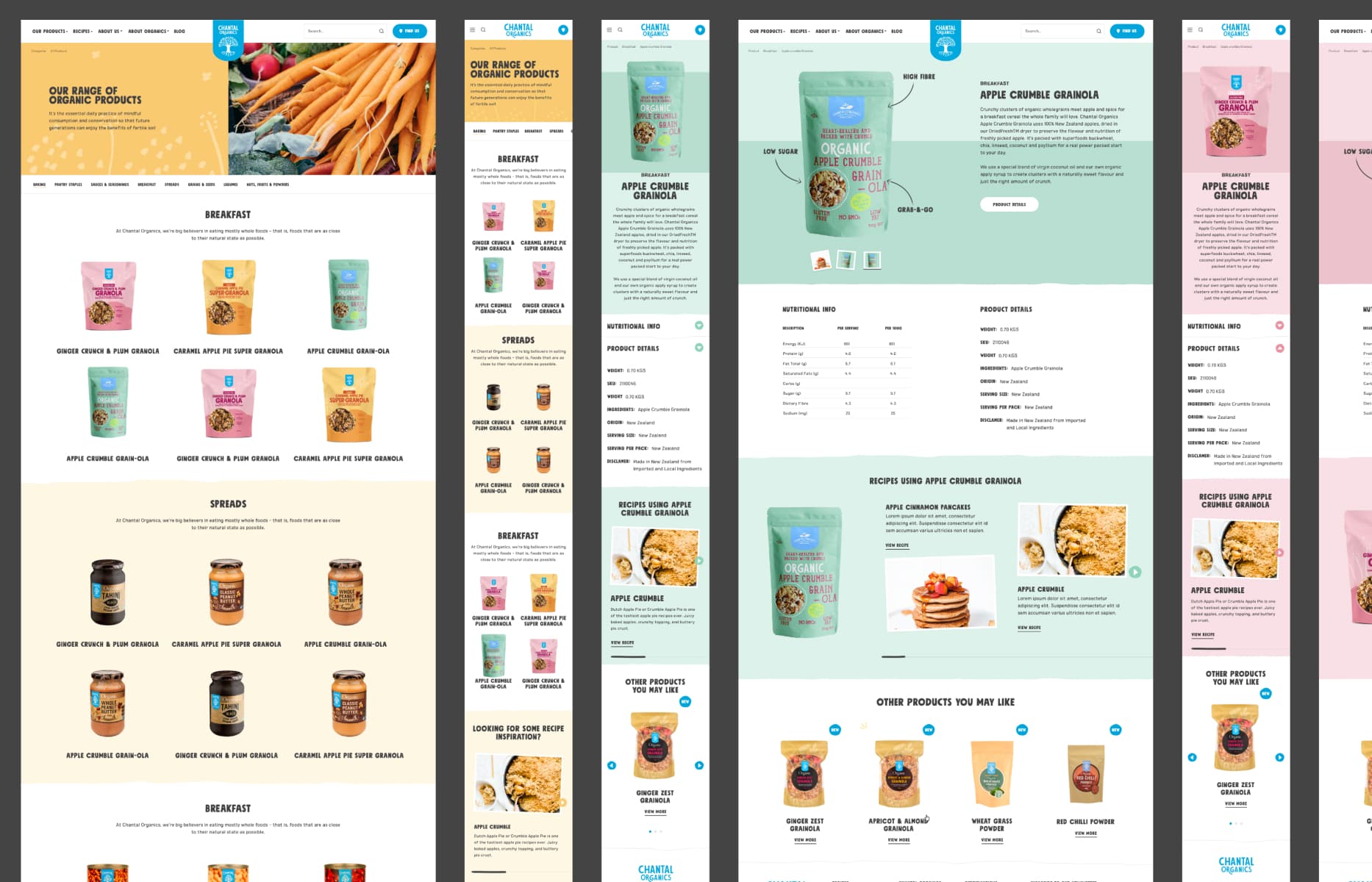
The new site captures Chantal's organic, handcrafted personality online with a playful, child-inspired approach that reflects the brand's family values. Customers can discover new recipes, learn about ingredients, and shop for products in a way that feels natural and inspiring. The flexible content system lets the Chantal team keep sharing their passion for organic living, while the recipe integration drives meaningful engagement with their products. Most importantly, it feels like shopping with a friend who happens to know a lot about organic food.
Interface in context
Selected screens showing how the experience translates key decisions into a clear, consistent interface.
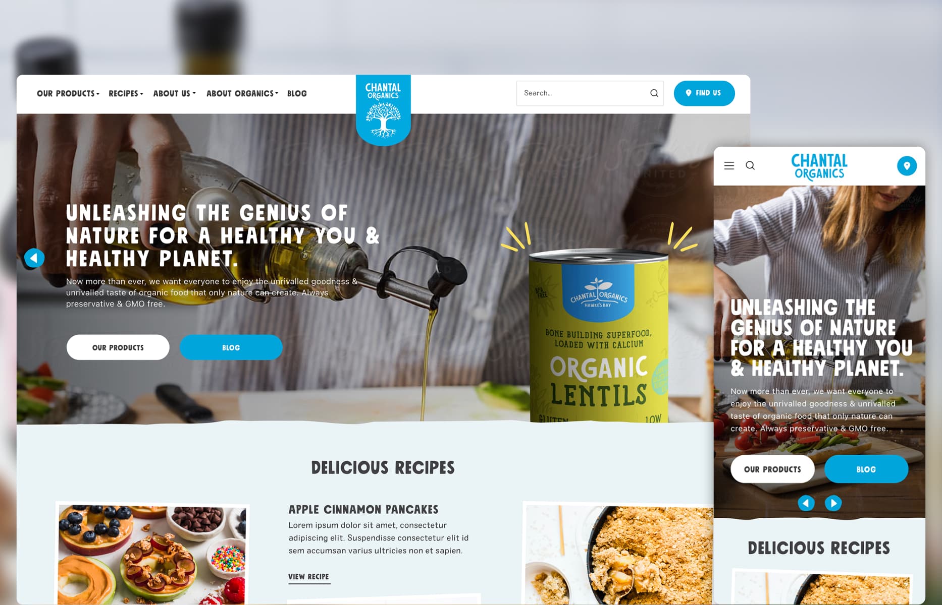
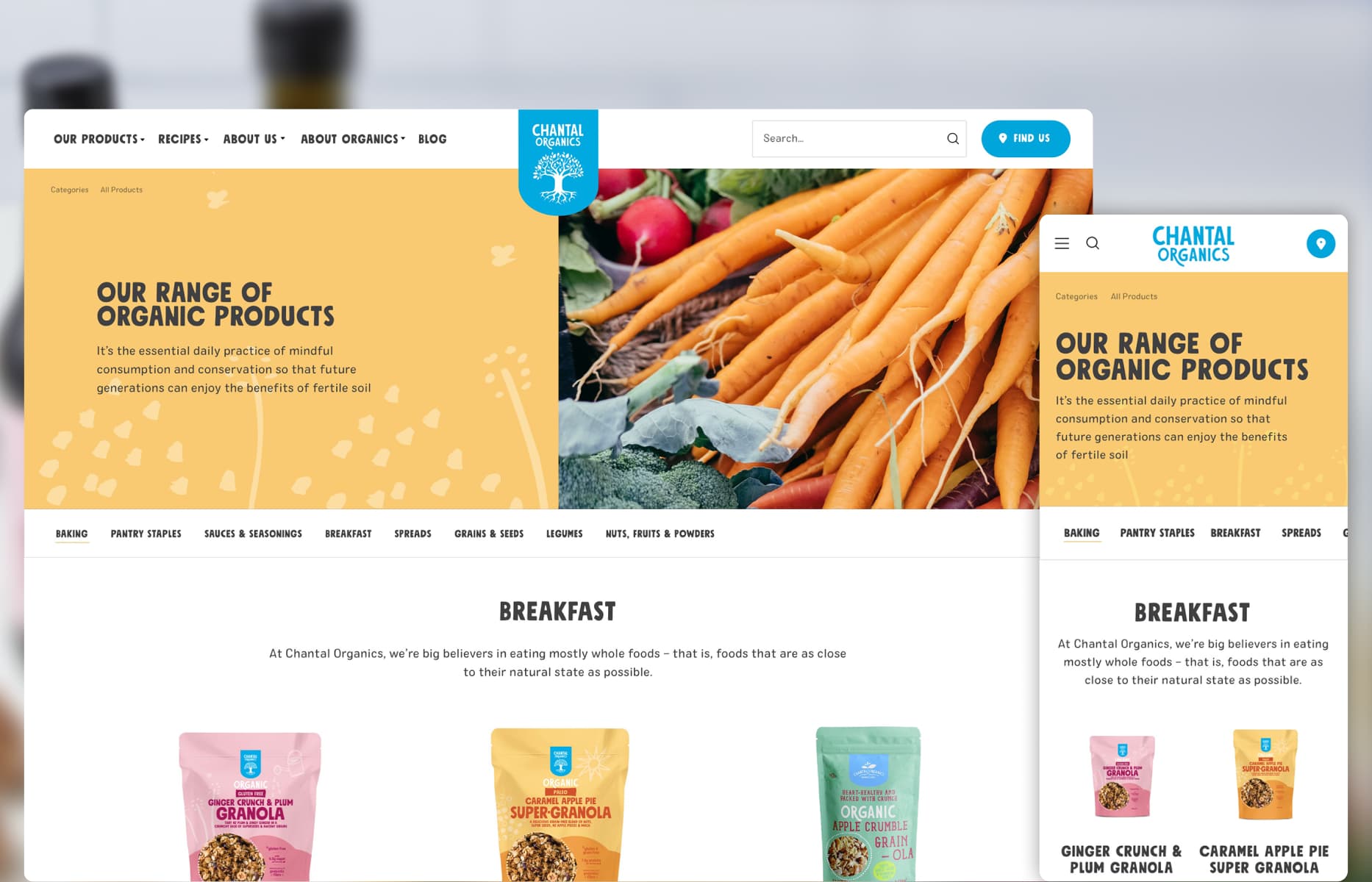
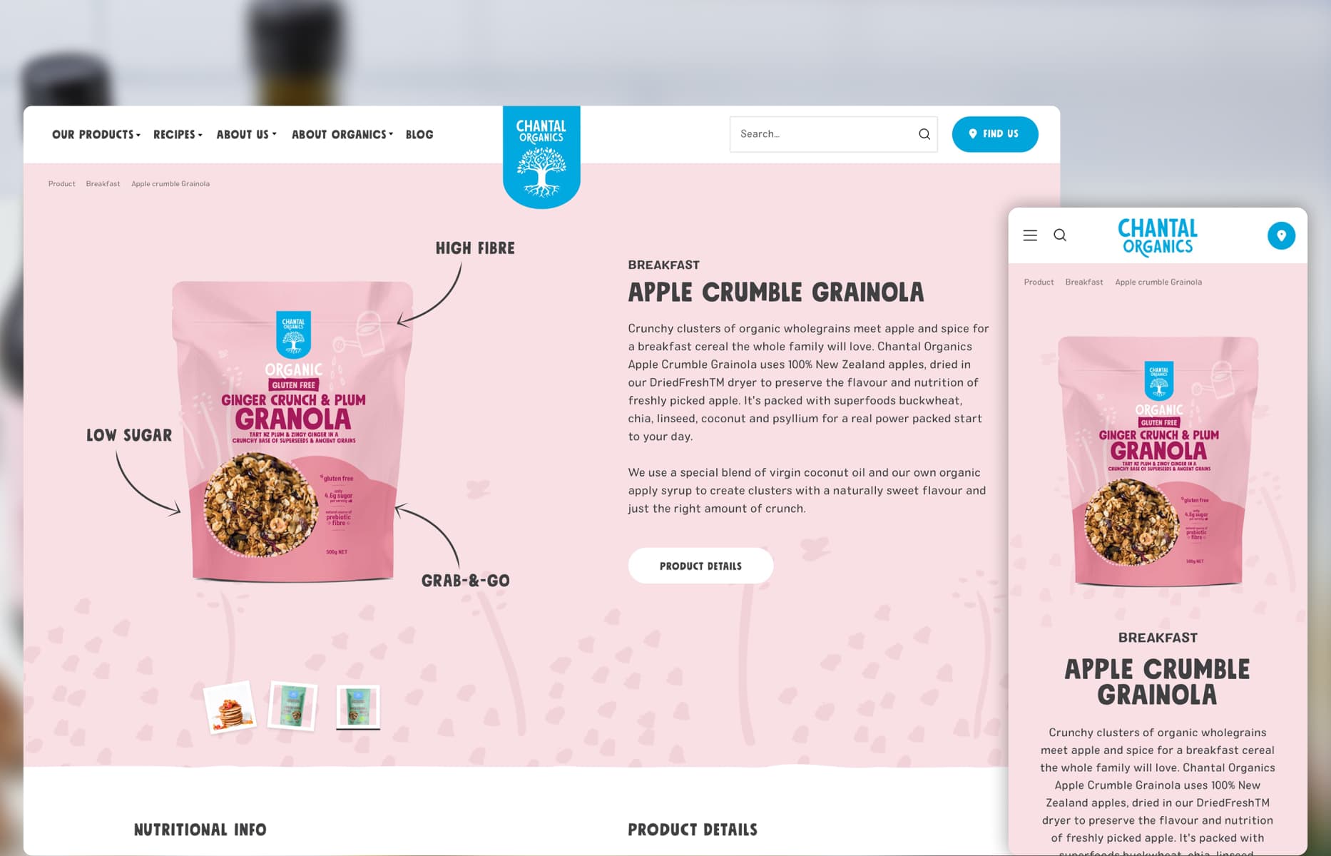
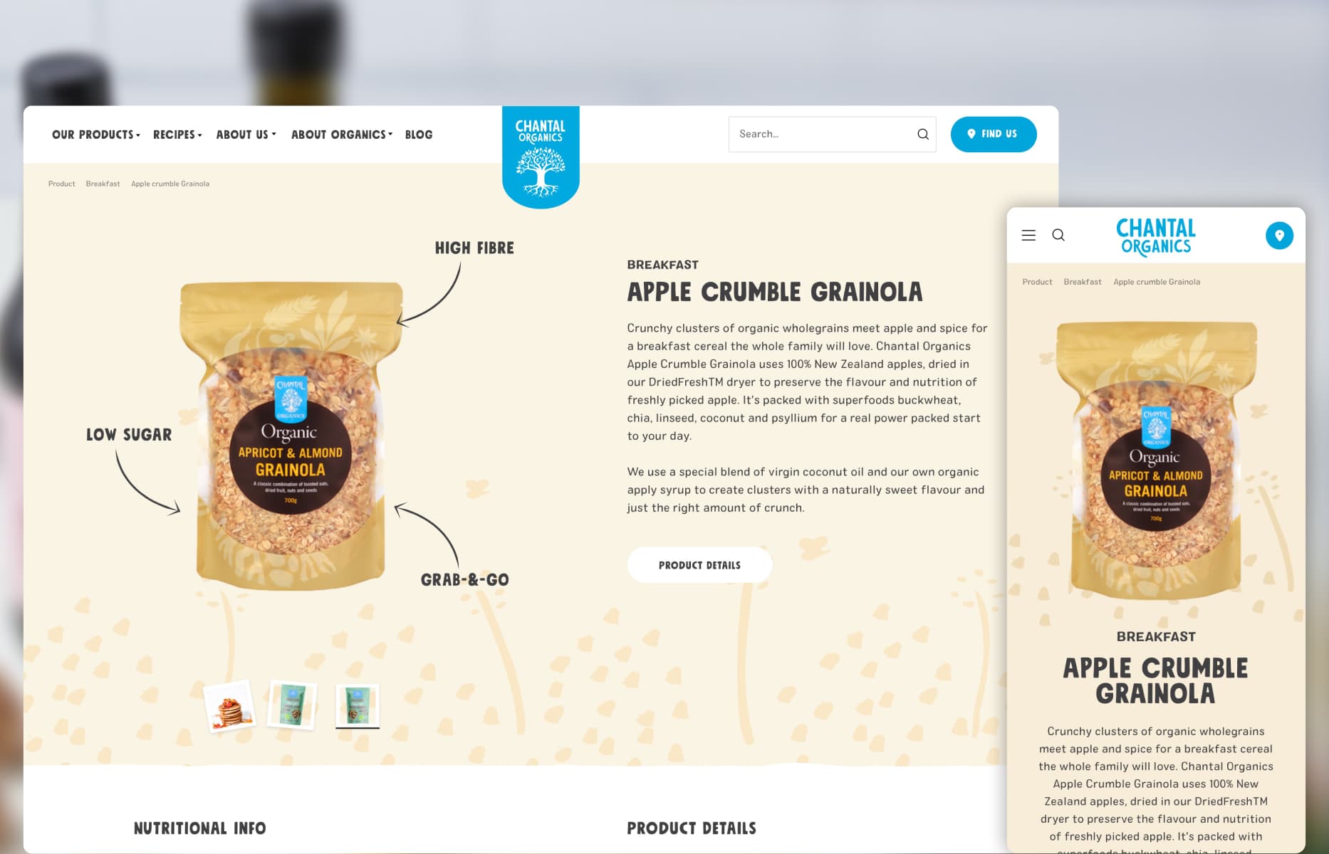
Connecting constraints to decisions
Each response traces back to a customer, operational or platform constraint.
Build an Online experience that embodies Chantal’s warm, organic brand values
Ingredient-linked recipes to drive product relevance and increase engagement
Encourage deeper engagement through lifestyle content and healthy living inspiration
Soft, vibrant UI language using earthy tones and playful illustrations
Design recipe discovery that supports product promotion without feeling overly commercial
Modular CMS components for recipes, product highlights, and lifestyle storytelling
Make product pages informative, inviting, and visually consistent across a varied catalogue
UX patterns that balance ease of navigation with discovery and surprise
Enable flexible storytelling via CMS, empowering the content team to update regularly
Consistent UI and hierarchy that reinforces trust while inspiring everyday use
Support brand trust with clear, transparent UX for ingredients and sustainable messaging
From ambiguity to delivery
The process was not strictly linear. Each stage reduced a different kind of risk and informed the next design decision.
User journey mapping for discovery, cooking, and find Chantal branches around NZ
Mobile-first wire-framing for kitchen-friendly recipe layouts
Color palette development using product packaging as inspiration
Modular CMS component design for flexible storytelling
Recipe subscription flow design to encourage return visits
Responsive testing across devices for real cooking scenarios

DIGITAL PRODUCT DESIGNER
My background in industrial design still shapes how I work: I think of digital products as practical tools that need to be clear, useful and well made. I bring that approach to complex workflows, clean UI and design systems that hold up in production.